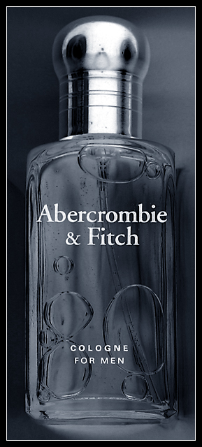
Somewhat of a last minute entry. I saw this sitting on my desk and exclaimed "Glass!" So I did a little set up and managed to take a decent picture of the bottle. Then I tweaked it up in photoshop. Manually desaturated of each color channel, and light level adjustment to achieve a more balanced look, then inverted, then increased the blue color balance slightly to get a silverish blue effect overall.
Statistics
Place: 170 out of 278 Avg (all users): 4.7937 Avg (commenters): 6.0000 Avg (participants): 4.7481 Avg (non-participants): 4.8587 Views since voting: 1132 Votes: 223 Comments: 10 Favorites: 0
Nice effect, esp on the lid area. The bubbles would indicate it was shot in a horizontal plane, rather than upright, but it works for me. I like it! -7-
A nice shot, the grey colouration looks good, though I think the bottles text is a bit distracting... did you take any with the bottle standing on its side? I can imagine that positioning getting the same good bubble formation while not having the text there.
Great shot, it would work as an ad. There's something that seems a bit 'off' about the bottle cap - I think that the strength of the image is in its crisp lines, and the focus seems a bit soft at the top, maybe. But very nice work. I like the b/w. It fits perfectly. 8





 Add photograph to your favorites
 Add photographer to your favorites

 Photographer found comment helpful.


