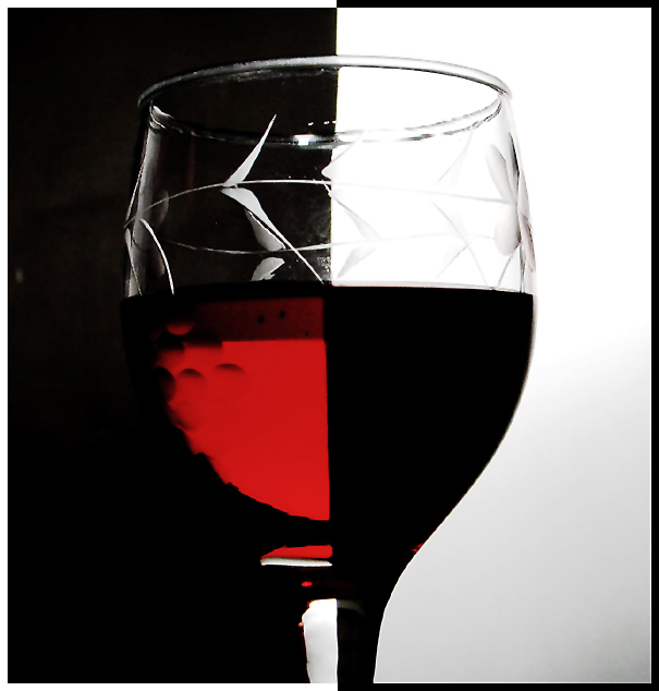
This is a remake of a very interesting photography that you can find in this site, called Two Tone Tonic. I find that it would be a good exercise trying to reproduce the trick, and thus make an interesting picture.
I made a black/yellow background picture too, but did prefer the BW.
Lastly, I don't think that this kind of thing is like stealing some picture but, more than all, sign of appreciation for the original one.
Statistics
Place: 102 out of 278 Avg (all users): 5.3099 Avg (commenters): 5.2000 Avg (participants): 5.2273 Avg (non-participants): 5.4091 Views since voting: 1269 Votes: 242 Comments: 17 Favorites: 0
Hey didn't we see a similar photo to this one a couple challenges ago? If you are dupicating the technique that was explained along with that photo, pretty good. I think a plain glass would create a cleaner effect.
I'm in two minds about this - on one hand there is the fact that it's such a close copy of a recent entry in a recent challenge - which means the creativity isn't your own - on the other hand I do appreciate that one great way to learn more to to try and emulate the work that one admires. The jury is still somewhat out for me - on balance I think it's great to imitate in order to learn but not so great to then enter the imitation into a challenge as one's own work.
About the image: I like the colour of the red liquid - it has a nice tone to it. My biggest criticism is the choice of glass - I think this kind of shot works best with a plain glass which really plays on the abstract geometric nature of the shapes created - in this case, the dimples and patterns in the cut glass detract from that geometry.
I like this entry, and I particularily like the two b/w border. IMO, for a shot of this kind everything has to be just so, perfect, completely straight, no shadows on the white background - and this one isn't quite there, almost, but not quite. I also think that a plain glass might have worked better than an etched glass. It is, though, one of the better entries in this challenge. (7)
Nice effect and contrast! My only remark is that the glass isn't very clear at the top. If it weren't for the distracting spots, this image would be a nice '90's design' image.
I wondered if anyone would do something like this or not. You are the only one as far as I know. It is good too, although I would like to have seen more of the red in the glass. The blackness is shrouding it out too much around the left side and the bottom.
Hard shot to shoot. you have done well. I will give high scores for technical merit but low on originality. I have seen this same set up many times... Dave
the top of the glass shows some flares, and slight blurs on the supposedly black area of the cup's upper area. The effect might have been better if you have used a completely clear glass instead of this one. The flower pattern on the top did not create a very good effect of light and shadows.
Might be more interesting if it hadn't already been done here. Also, the designs on the glass distract from the effect, and the glass is a bit dirty, which throws the lines off a little.






 Add photograph to your favorites
 Add photographer to your favorites


 Photographer found comment helpful.


