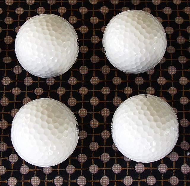
probably hard to get a better idea of the detailed texture on this subject because it is so white so parts of the golfballs show clear texture while parts are overexposed and looking smooth
good composition, i like the contrast with the backing material, if you had got the pattern between the balls and the material perfectly symetrical i would have given a 9, as that would have worked better for me, but that is purely my opinion- therefore 8
I think I would have preferred to see either all the words on the balls or none at all. Nice setup and your background adds a nice touch, though its a little dirty in the center and lower right.
I like the composition against the subliminal background. It is quite distracting though that you can see parts of the text of the golf ball.Maybe this was unavoidable but worth a shot. Compositionally, the symmetry is a bit off. The balls to the left are in perfect alignment whilst the right is just a tad of the mark. The small fleck of lint on the lower right side and the middle is a bit distracting as well. i applaud you creativity though as this is quite different from the rest. Great try.






 Add photograph to your favorites
 Add photographer to your favorites


