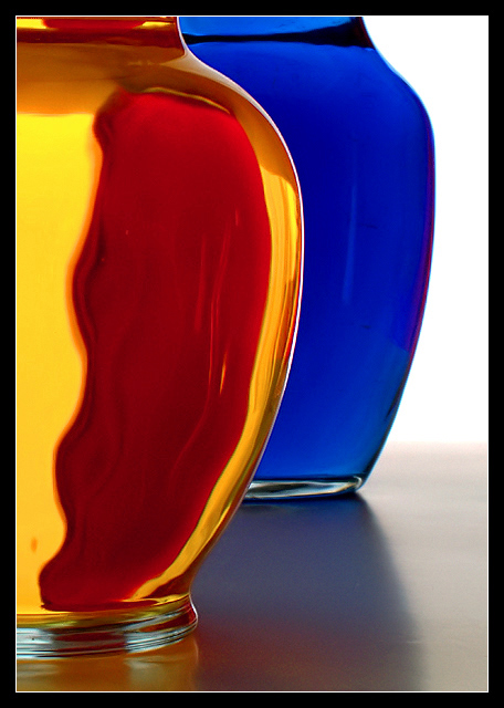
This idea came from a gallery I saw on pbase. I set up my strobes and put some food coloring in the glasses. I then did different configurations until I found one I liked.
Statistics
Place: 5 out of 99 Avg (all users): 6.9850 Avg (commenters): 8.3158 Avg (participants): 7.0256 Avg (non-participants): 6.9273 Views since voting: 2929 Votes: 133 Comments: 22 Favorites: 1 (view)
Excellent shot. I like the way you've lined the 'necks' of the vases up to balance the shot. Colours are great, especially the red in the yellow vase. 10
I like the white space starting to the right of the blue vase.. just wish there was more of it. Otherwise, totally crisp, clear and flawless with beautiful colour.
Ooh this is clever - is the one vase actually yellow and red or did you use some clever lighting or liquid content? I like the even lighting - not too strong or too feeble - brings out the colour of the glass. The composition is nice. The background is a little bland in comparison to the glass and I think the crop at the top feels a little odd - not sure whether it might be better to include a touch more vase necks?
The red looks so liquified - it's beautiful. I like the backlighting casting shadows forward. I may have tried to include the tops of these - if there was no reason for not doing so. Excellent shot all around. 9
excellent abstract... the smooth texture and color scheme in this photo work well for the challenge... the high key background also sets off the blue nicely... great work :) = 10 - setzler
I don't know how you managed to get that red into the yellow vase there but it has come out very well. That and the choice composition as well as the ideal lighing make this one of my favourite images in the challenge.
very nicely done. only suggestion would be if you tried the shot with more space on the left and right instead of a portrait shot, where the negative space would serve as a contrast to the colors and help us focus on them w/out them becoming/dominating the photo as you did above.





 Add photograph to your favorites
 Add photographer to your favorites

 Photographer found comment helpful.


