Fit Challenge Criteria: 1/2
Color/Contrast: 1/2
Composition: 2/2
Photo Quality: 1/2
My Subjective Affinity: 0/2
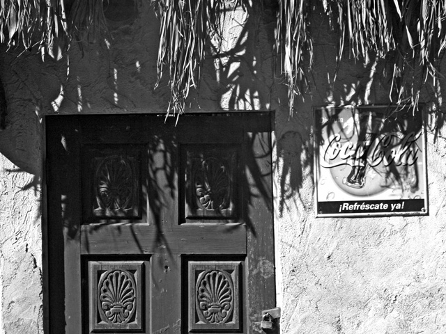
The shadows are exposed really well on this, but while sacrificing the highlights. The composition is appealing, but the coke sign distracting. Also, perhaps a little more straw from the roof might have helped a bit.
With the wall presumably being a light color, the light makes it just a tad harsh. Maybe tone down the bright just a touch. Interesting play of shadow with the grassy roof. I find the Coke sign a bit distracing. It could be as effective if it were completely cropped out and shot from a diff. angle so the door isn't dead center. Hope this is helpful. Good luck.







 Add photograph to your favorites
 Add photographer to your favorites


 Photographer found comment helpful.


