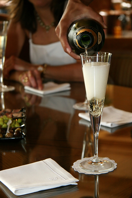
Nice... the random arm and girl actually give the photo some sense of symmetry. I like it... though I don't see the texture part prominent..Thus it's not getting the 8 it deserves.. 7!
If the bubbly is the main subject of your image, you give it far too little space. I would have made a much tighter crop around the glass. Lighting and execution is great, though.
This would be a great shot for an advertisement. The lighting is great, the DOF and POV excellent, color/tone well done. 8- good luck in the challenge!
This could have been an excellent shot, unfortunately its too busy. Too many other objects taking the eye away from the actual champagne texture (main subject)
Her or the wine? Heck maybe both was your intent. I like your depth of field blurring her just the right amount. Colors and lighting is very pleasing too.






 Add photograph to your favorites
 Add photographer to your favorites


