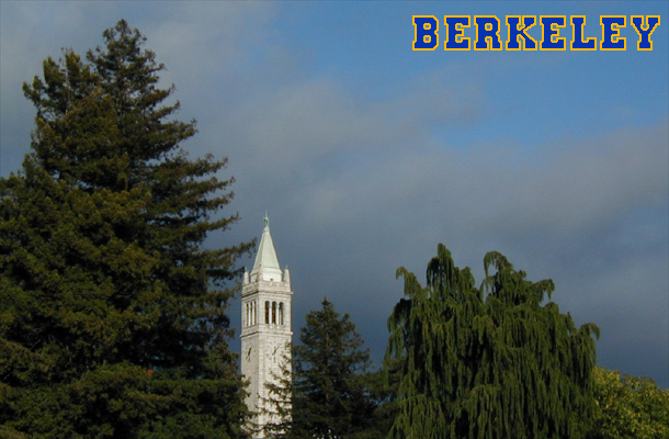
Probably the most recognizable landmark in the East Bay, Sather Tower ("The Campanile") was well-lit by a setting sun, and framed by some nice trees. I thought this shot had the best combination of lighting on the tower and some darker clouds for contrast.
The nearest corner is vertical, although it looks a bit slanted.
Statistics
Place: 96 out of 106 Avg (all users): 4.9194 Avg (commenters): 5.3750 Avg (participants): 4.9494 Avg (non-participants): 4.8667 Views since voting: 1503 Votes: 124 Comments: 9 Favorites: 0
I am so glad I get to write something about your postcard! For now at least it's more fun for me to write about photos I like. Someday, when I learn to be diplomatic and witty, I might enjoy writing about photos I don't like.
On first impression, your postcard hit me as a bit "corny" (like any good self-respecting postcard SHOULD be). It's also "so academia". I guess the lettering is what gave me that impression (duh!).
I love the powerful sky! Plain skies are so boring. The white tower is beautifully framed by the dark trees. The dark trees match the mood of the sky.
I'm wondering if you tried going in a bit closer, for instance, cropping about 1/6 of the total width off the left hand side, 1/8 to 1/9 off the right hand side, and about 1/5 of the total height off the top - nothing off the bottom. Lettering in the same place, same style, possibly even slightly bigger. It might make it a more powerful postcard.
About the lettering, two things.
(1) The "K" and "Y" look a bit ragged. Might be the font. You did have the anti-alias turned on for the lettering, right? Some of the entries to "Postcard" did not.
(2) The spacing (the distance between the individual letters) is not consistent. For example, the distance between "B" and "E", "E" and "L", and "E" and "Y" is larger than the distance between "E" and "R" or "K" and "E". This last distance would seem to be the correct, or best, choice. Sometimes this is a problem with the font. In such a case, I manually move the letters (when the lettering is important) so that the spacing looks just right.
Anyway. I enjoyed looking at this postcard again, and in greater detail. It's a fun postcard, it makes me smile. Take care,
The stormy sky and angry clouds make for a decent background here. Who said all postcards MUST have a crisp blue sky as a background? You've gone against the rules of postcard regulations and showed them it can be done this way too, good one :-))))
I like this postcard, even though I think it's not the best photo in this challenge (please don't get offended :) I like how the picture can be divided into two triangles (top left - bottom right). The tower looks beautiful, but overall the picture looks a bit fuzzy, and the trees are so dark! I love the lettering, it looks just right for the picture






 Add photograph to your favorites
 Add photographer to your favorites

 Photographer found comment helpful.


