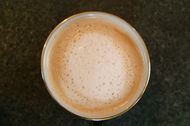
Having this in the center of the photo isn't working for me. Texture is ok, but the presentation is lacking. There are no distracting elements in the background, which is good. I wonder if this might work better with just the right 1/2 of the photo. take it and crop it right down the center and I think that would add some visual appeal. Focus and clarity look good, and lighting is also ok. Just needs a different crop in my opinion. ~Heather~
I see what you're trying to do here and I think it's the texture of thr froth you're trying to convey. It would probably be best if you came in tighter within the frame so that the distracting background is out of focus or even non-existent. It's a 50/50 split between your background and your subject so the value for both is a bit over saturated. I can almost feel the froth of the milk but it's just a little too far from my reach. Great try though.





 Add photograph to your favorites
 Add photographer to your favorites


 Photographer found comment helpful.


