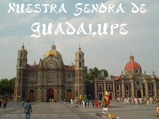
FIRST IMPRESSION: A bit busy in the foreground, and I don't like the font.
CHALLENGE: Meets the challenge.
COMPOSITION: Perhaps the most bothersome items in this image are tha man in the foreground whose feet are cut off, and the abandoned chair and other items. Other than that this is a pretty good shot.
TECHNICAL: Though this could be a trick of perspective the shot does seem tilted slightly counterclockwise. Exposure and color are good, however.
CONCLUSION: A good shot, unfortunately the items that could have made it better were largely out of your control.
Thanks for sharing and good luck in future challenges!
I sense that you used a wide angle lense to capture this scene. The distortion of the buildings is such that the buildings look very silly and tilted. It is a nice scene, however, I think that the distortion ruins it. Focus and clarity are good, and the angle at which you took the image is good, just way too much distortion for my personal tastes. ~Heather~
Typical postcard shot for sure. Somehow however the colors aren't coming through as well as they should. You could have remedied this by adjusting the levels or saturation in a editing program. Good luck.
beautiful building, and I like the activity you have captured around them. They look useful and a part of life still. Howeve, the shot seems a little dark and dull, and the building is in a big shadow that takes away from its beauty and detail. Maybe if you shot during a brighter day or did some post processing adjustments to brightness and contrast? :)






 Add photograph to your favorites
 Add photographer to your favorites

 Photographer found comment helpful.


