Hello from the Critique Club-
I am slow and I have been holding your postcard hostage for a few days. Sorry.
I'm going to leave the lettering issue alone. Enough people commented on it and it know nothing about how to add lettering. And the other issue I have to get out of the way is a personal pet peeve: straighten the horizon. Whether or not your photo is straight and the fence is crocked, whenever you put a line that my mind interprets shoudl be level next to one picture edges, the picture will feel tilted.
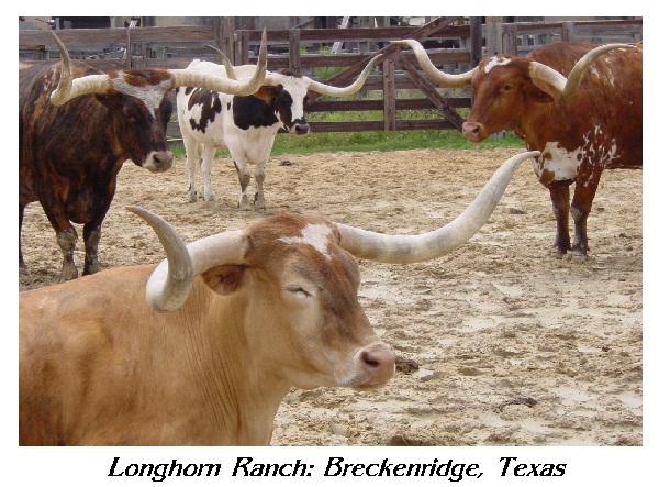
Now the things I like, in no particular order. I love the colors, the muted browns look so nice together. The cattle and the ring and the fence are each a diffrent shade of brown/tan. Next I like the horns!! What a creative leading line? I like a leading line that brings the viewer back into the photograph, it helps the image to get the attention it deserves if the eyes travels back a few more times. Here the horns which are so dramatic anyways, create an interlocking pattern and link together in a wavy roller coaster circle to unite the image. I especially like how the horn in the front reaches right out to draw me in. I like the circular placement of the cows. I wish the green grass hadn't been there. I think if the dirt pit had extended right up to the fence there would have been less visual distraction and the cows would stand out better.
Great photo techinique all around, DOF, lighting. Maybe you could wake up the sleepy longhorn in front. Or maybe his bored expression makes his fate more poignant. This is a stockyard?
I don't like the italics on the title for the postcard, but I think these cows are very cute, I like the way they're all just "hanging around". 8 - Pam
Very good focus and color! The foreground cow seems just as strongly composed as the background one! The sand/dirt flooring isn't exactly a letter perfect setting, but that's a nit. 9 Rob the Swash (love the expression of the front most cow!)
I've never seen cows/bulls like that before, those horns almost look unnatural! Good capture, maybe just a little too tightly cropped tho, but still a postcard shot.
Wonderful composition here--it gives a good "random" quality to these animals. The light is a bit harsh or the colors washed a bit, but you captured the essence of these animals here, and in so doing, captured the essence of Breckenridge, too.
This is a wonderfull photo. The background is a little disturbing because it's not totally lined up with the border, but besides that the composition is great.
The text below the actual photo is not perfect, but it I realize that not everbody is using high-end photo editing software to add text. All in all, a very good job!
Hey!! I used to live in Cisco, TX! I'm really enjoying this challenge and being able to re-visit places. Sorry...onto more important things. :-) The placement of these longhorns is absolutely perfect!! You had to have trained them to pose, however, it would have helped if the beautiful one in front had his eyes open. The lighting is perfect, the colors came out great and there is good focus and definition. True spirit of Texas! 10
The text seems a littel grainy. Not sure what happened there. With that said, the picture itself looks great. Teh colors are really smooth and feel really good in this image. It's a great shot and very fitting as a postcard.





 Add photograph to your favorites
 Add photographer to your favorites

 Photographer found comment helpful.


