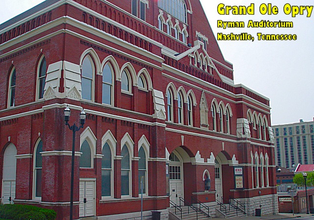
This is actually the first home of the Opry. It is now situated near Opryland Hotel but they still play occasionally at the Ryman which was patterned after a church, including the wooden pews as seats. Very Uncomfortable!
Statistics
Place: 94 out of 106 Avg (all users): 4.9440 Avg (commenters): 5.3077 Avg (participants): 4.8272 Avg (non-participants): 5.1591 Views since voting: 1072 Votes: 125 Comments: 14 Favorites: 0
I think there is a conspiracy in the CC with me getting your pictures! :) I hope you don't get sick of me and my suggestions! At least I get the chance to expand on my original comments on this photo.
Colour, Composition and Contrast:
I like your choice of subject a lot. Architecture and buildings are naturally dramatic shots I find. I miss the top of the building though, and would have liked to get the peak in, especially if it is modeled after a church, I think it would be a good inclusion in the shot. I like the angle, and prefer it to a head on shot, but almost wish you were a little more to one side or the other to make the angle more dramatic.
All the colours seem a bit shadowed, though I think the contrast is just fine. I am not fond of the yellow font, I think it detracts from the building, but the size and place is good, and with a right justification as Paul suggested below, it would be bang on! :)
Focus and lighting:
I think your focus is crisp on the building and I haven't a word to offer you in improving that! :) I don't like the compression artifacts on the beige building to the right of our subject, but jpeg compressions are notorious for messing with fine lines.
On lighting, I think the whole shot appears to be in shadow due to the overcast day. As kiwi suggested, it would have been nice if the day was a bit sunnier to give you some interesting sky either blue, or even a few clouds and to give a little more light and brightness to the building.
Overall
I like this shot, its certainly great fodder for a postcard and I like the trivia behind it. A slightly brighter day and slap a thin border on that baby, and you've got yourself a fine postcard! :) Well done.
This angle gives a good idea of the whole building. If you right-adjust the type, the left margin will follow the roofline, especially if you reduce the size of the last line slightly.
ooh..why the yellow text? it doesn't match with your photograph! This isn't the most dramatic angle on this building it would seem, and it all needs just a little something to make it "pop" as it were..perhaps if you moved to your right a little and got a slightly more head on view? :) Just an idea!
I have heard a lot about this place but never actually seen what it looks like. Now I know thank you. You have taken this pic from a very good perspective and cropped it well. What a pity you didn't have blues skies to make this a perfect shot! But you can't control the weather I guess, I like it anyway :-)
I must be brutally honest here. I hate the text color and font; it's just gaudy. And the framing of this pic needs to pull back and show the whole building, or move to a different perspective.







 Add photograph to your favorites
 Add photographer to your favorites


 Photographer found comment helpful.


