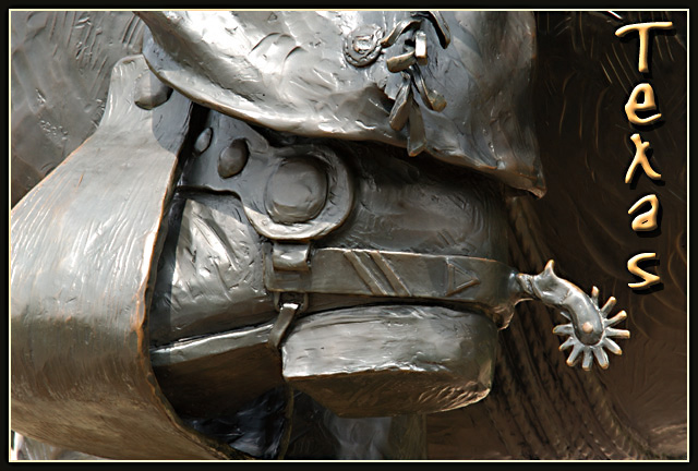
Great idea! I particularly like the bit of light under the heel. However, I would give the text more room (maybe smaller font and run it horizontally in the upper right corner?)
Very postcardy, and technically speaking a beautiful shot. The only thing that kept it at 9 and not 10 for me was a lack of a certain spung, that magic 'Wow!' spark. But I have to save 10s for *something*, right? :-> There's absolutely nothing wrong with this shot that I can find, it just doesn't smack me in the face with the wow factor.
Lvoe it! I love the angle and framing/cropping, the lighting is wonderful, and the focus and clarity are great as well. A 10 from me this week. I even really like where you put your text. Just enough room without crowding it or the photo. Great job. ~Heather~
An exellent illustration of what Texas is. Nice accompanying text. Is this part of a statue? I love the crop here. It makes me want to see more. Perfect color - 10.
You have captured the essence of the concept of Texas. Your photograph is most excellent - crisp - light - detail - composition. Also, your text font and border are very tasteful.
From the thumbnail I thought this was a real cowboy's boot, I almost wish it was, but still I love the idea. The shot is a bit dark near the top right of the frame, but that does give you a more even background to put readable text on so it all works.
Picture Perfect postcard. Great job seeing the potential in just shooting the spurs and placing the text on the right. You should look into selling this. - 10
This is good! There aren't too many postcards in this challenge with humor. This one is humorous and I like how you have composed it. Nice color, contrast and detail. You got my thumbs up here!
Like the image and it reminds me of the Don't Mess with Texas motto (which is such a great motto). The Texas text fits in well, too. My problem is that it so very much the representation of a work of art, although you cropped it well to its essence. 7
Nice shot, I love the texture of the boot and spur. And the "Texas" font goes well with the shot. Maybe try putting the logo at the bottom, although it does fill that dark area well.
great shot... this is my favorite of the challenge. excellent composition and the lighting creates good definition for the detail in this image... = 10 - setzler
This was an amazing idea!! True spirit of Texas and nice photographic art. I would have definately bought this as a post card if visiting to send. Now I can't wait to find out what statue this came from and where. I haven't been through very many entries yet, but I truely believe that you have a winner. 10






 Add photograph to your favorites
 Add photographer to your favorites


