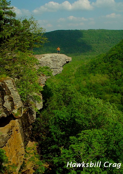
Challenge:Postcard (Classic Editing*) Camera:Sony DSC-F707 Location: Newton County AR close to Boxley Date: Apr 30, 2003 Aperture: 5.6 ISO: 100 Shutter: 1/1000 sec Galleries:Landscape, Travel Date Uploaded: May 4, 2003
my first impression was - WOW - that's quite some scenery there. Definitely postcard material!
COMPOSITION / CONTENT - Composition is fine. Your husband is positioned so that the viewer can easily take in the scenery but won't miss him (and you wouldn't get the sense of scale if he wasn't there). If you hadn't said you didn't know about the challenge I would've suspected that you planned for him to wear an orange shirt! It fits in perfectly, makes him stand out without standing out too much. For a postcard, I think I would've preferred him looking over the land rather than right at the camera but that's a minor quibble. It's a shame there was a big cloud over the woods in the back but of course you didn't have control over the weather ...
CAMERA WORK / TECHNICAL - I think you did pretty well here. Everything's nicely in focus as it needs to be for a scenic postcard such as this one.
POST-PROCESSING - The lush shades of green are very nice, I'd like the sky to be a little more saturated and blue (as they are often a little oversaturated in postcards), but overall I like the colors. The text is sized about right and I like the font, I just would've moved the text a little more to the left, right now it feels too close to the edge of the picture.
I like your entry to the challenge a lot, and so did most of the voters judging by the score you got. A well-deserved high placing. I just read through the comments, and it seems that many people agree with me on the sky and I'm in the minority on the text ... I do like the suggestion to add the state to the text to make it even more postcard like. Good work, keep it up :)
Please let me know if you have any questions or comments about this review.
Excellent. How much did you have to pay him to stand there? You'd have to pay me a lot! It's a tiny bit dull - perhaps tweak the contrast/brightness a little.
Great photo. I like the balance between the sky and the trees. It would be too easy to get too much sky or too many trees, but you got a healthy dose of both. Plus you did well to capture the height of this outcropping. Gotta say though you missed out on a great opportunity for some kind of slogan. Anything...
Good postcard shot. The green tones come through well. This would have looked awesome if you had used a polarizer filter to bring out the blues of the sky.
Very nice framing and exposure. there is a pronounced yellow cast to colors. If others comment on this as well, consider checking your monitor calibration. I've been burnt on one of my submissions that I edited on an uncalibrated system!
Oh man that guy is brave standing out there!!! The shot overall has a greenish/yellow "tint" to it. Do you do that on purpose to make it look older? The text isn't very good. Should use a nicer font and then add in the City and State. Great pic however!
THe contrast on this picture seems a bit to high to me. The Greens are so green, yet somehow the blues aren't very blue. The shot itself is really nice I like the perspective here a great deal. The white text doesn't seem to fit very well, I'm not sure what I would do to make that look better. Overall this would be a decent postcard. Good job.





 Add photograph to your favorites
 Add photographer to your favorites


 Photographer found comment helpful.
