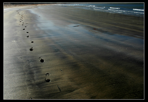
I did this in a three of four days hikin trip in Hornstrandir which is one of the northest parts of Icealand. The name of this place is Bolungarvik. A beautiful place where no one lives any longer.
And when taken I was just enjoying the fine weather we had there but not at all thinking about DPC.
----------
PS work:
resize
crop
levels
color balance
border
Statistics
Place: 6 out of 139 Avg (all users): 6.7443 Avg (commenters): 7.6818 Avg (participants): 6.6024 Avg (non-participants): 6.8309 Views since voting: 2478 Views during voting: 378 Votes: 219 Comments: 31 Favorites: 5 (view)
Thanks for all comments and voting. I think all comments were more or less very positive this time. And I'm quite happy with the top 10 finish this time.
I absolutely LOVE this shot. IMO it was the best, most subliminally-accurate interpretation of "independence" in the challenge. Congrats on your top-10.
Appealing composition ... sparse and stylish. Very nice effect of the water-saturated sand through the midground. It's one of those uncommon images that evokes non-visual sensations for me; sounds and smells. Good job. 8
I like this. The solitude, the colors. I would like it even more if the footprints were walking away from you, but then again, that would've requred you to walk backwards to setup the shot. I think it would've conveyed the concept of independence better though. Nice shot either way.
Wonderful image that represents a range of related concepts so simply and minimally. I find it a touch dark towards the left side of the frame and the crop at the top a touch tight (if that's to exclude unwanted objects perhaps cropping tighter still might strangely make it feel less tightly cropped?) but overall I think it's lovely. 8
Love this image. Something very peaceful about it. I think if the feet were traveling away and barefoot it would be a perfect 10. Cliche, I know, but what can I say? Think the crop is well done. Can't tell you if it would do better with sky or not. Creatively good also. Colors/tones not too strong but part of that is lighting part of it is sand is just not that interesting. 7 - Good luck in the challenge!
This is by far my favorite shot for this challenge! A big fat 10 from me. Composition is perfect and I just love images that convey a story! I hope you ribbon!
Like the colours and the message. Dislike the heaviness of the frame on this shot - would have preferred a lighter one if it is necessary at all.
May be a stupid observation but I would have preferred to see the footprints going away from the camera. Yes I know that would have ben difficult. Expecting a top ten at least here.
Great leading lines! I like the simplicity and the cool of the water amidst the warm of the sand. The framing is perfect. A simple as this it, I find it an extremely interesting capture. 8
I really like the framing. I whis the prints were going in the other dirrection and the sand a bit more contrast with the prints. Still a good idea and well shot - 8
Nice idea. The crop feels really tight, and there is a lot of negative space in the middle of the frame. This shot might have been improved if the waves were closer to the footprints, or if the reflection on the sane in the middle was a little stronger. Overall, a decent image. Good luck in the challenge.
awesome shot, but the border doesn't work for me here. i know i know, one of those border comments, but yeah, i just think it would have work so much more without it because it's distracting. anyways, i'm sill giving you an 8






 Add photograph to your favorites
 Add photographer to your favorites

 Photographer found comment helpful.


