Author Thread Comments Made During the Challenge
Post actions
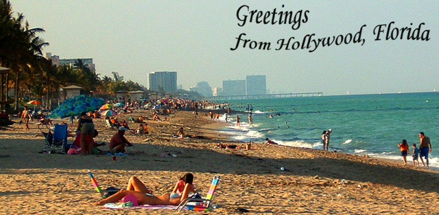
That's a pretty serious tilt there...
Post actions
Nice use of line to draw our eye up the beach! The lighting and tones do not really make this look like an inviting, engaging place to go, though.
Post actions
Very very typical! You have taken a postcard shot as close to the postcard cliche as possible, well done. I particularly like the angle of this shot.
Post actions
straighten the horison and come back when there isn't such a big shadow on the beach
Post actions
The horizon is tilted just a little to the left and the shadow on the people is distracting, maybe because they are the main subject based on the rule of thirds. If you could have gotten the hot babe in the foreground to pose, and made her the subject this shot wound have been even better. Nice Job.
Post actions
This one looks like a 70's post card also, with the coloring and font. Good job!
Post actions
looks a little grainy/1950's-ish, whether intentional or not i like it (horizon seems a bit off, however)
Post actions
I like the movement in the text and the overall image, I think the text is a little too overpowering for the image. may be a lighter color would help.






 Add photograph to your favorites
 Add photographer to your favorites


 Photographer found comment helpful.


