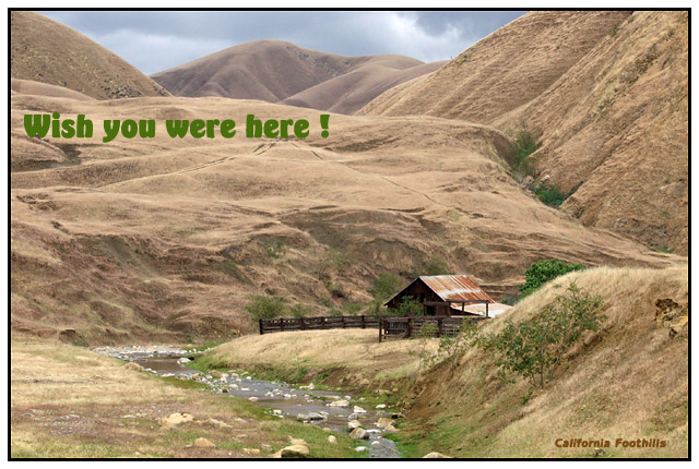
I pushed the saturation and unsharp mask to get the look of the old rough textured, hand colored postcards. The natural texture of the hills and already browning California hills add to this concept. I waited for a long time for some sun but it never came, it looked like rain was coming soon so I moved on. Enjoy.
Statistics
Place: 39 out of 106 Avg (all users): 6.0794 Avg (commenters): 6.9444 Avg (participants): 5.8333 Avg (non-participants): 6.4792 Views since voting: 1244 Votes: 126 Comments: 21 Favorites: 1 (view)
Firstly a congratulations is in order for your,"Come Visit the Mer Bleue Bog in Ottawa!", A very wonderful place to enjoy, someday I will get to Canada and see for myself. You have some very stunning photos in your collection on DPC, an indication that the competition just keeps getting tougher. Keep up the good work.
I had a lot of fun making the "1910 Hand Colored Postcard". I had picked up my oldest daughter to go with me on the hunt for my perfect post card picture and when we decided to use this setting we knew it was the spot for us. After hiking back into the place, picking up garbage that passersby's had dumped, and taking quite a few pictures we started our walk back to the truck. This was quite a long walk and I kept looking over my shoulder hoping to get a better view, and wishing that the sun would peek through the clouds for just an instant. It was during this walk that I had the perfect vantagepoint for this picture.
It was a poor call for me to add the green message, but I had some old cards and some of them had similar messages so I went with it. Oh well live and learn!
I thank you for such a complimentary critique and hope you enjoyed writing it as much as I have had in my response. Keep shooting and most of all have fun.
I am so glad I get to look at your postcard again, in detail. It's a lovely postcard. I don't see anything wrong with the photo. The only thing I need to say (again, I guess) is that the green text to the top left seems out of place. I think that if it wouldn't have been for that green text, this would have been a lot of people's favourite postcard.
The colouration, the framing, the composition, everything (except the green text) is just right. I like the little bit of grey/blue sky shadowed by the brook at the bottom. I love the hill line, the juicy green grass by the brook, the shininess of the water as it comes around the corner.
I thought for a moment that a "raggedy" edge would make this look more like an old hand-coloured postcard. But then, you were creating an old postcard, and, when new, they wouldn't have had a raggedy edge.
Anyway. Congratulations on an excellent entry! By the way, you have quite an eclectic collection of photos in your portfolio. Nice.
I like the muted colors, the texture of the land, the peek at the blue-gray coulds mirroring the stream in the foreground. I dont like the lettering, although the "wish you were here" is funny in the context.
Wish the text wasn't there! Okay, the 'California Foothills' is fine, but the rest is way too distracting. Otherwise an excellent photo, and indeed captures that hand-colored feel.
The differing textures of the hills is really cool. This looks like a nice remote getaway. I think the cloudy sky is pretty fitting too with this rough looking terrain.
Great composition. Love the house and stream in the lower third. Not crazy about your placement of text. I know it's personal taste but I think it would be better down on the bottom, or eliminated all together. "California Foothills" is enough.
Beautiful shot..... Your title is a little unusual to me, though, because your choice of font is really not in the spirit of the early 1900's. However, I do love the greens and browns of your composition. Great textures.
It does look like one of the old coloured postcards! Very nice. I think maybe the green words (Wish you were here!) do not match the "old" look of the card, the small "California Foothills" does. The font of the green letters looks "newer" to me.
It really does resemble a painted photo. I really like the position you chose to take this pic, the composition is awesome.The stormy sky out the back breaks up the dominant brown color perfectly. You can be proud of this photo. What is bothersome to me is the "Wish you were here" text. Personally I would have left it out completely. Or if you really wanted it to be included I would have placed it in the lower lefthand corner.
Very nice picture but the location of the text spoils it a lot for me. I think that in general the text should be outside of the picture or at least very low key...





 Add photograph to your favorites
 Add photographer to your favorites


 Photographer found comment helpful.


