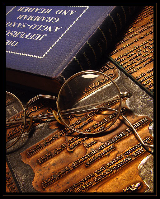
"The Jefferson Anglo Saxon Grammar and Reader" is a textbook written by my grandfather, great grandfather, and great uncle. Each of their names are somewhat visible in the image. The metal plates underneath the glasses and book are the plates that were used to print the book. The glasses belonged to Prof. Edwin Lake Setzler (my grandfather). This photo is a tribute to my grandfather b. 1903 d. 1977.
Statistics
Place: 14 out of 278 Avg (all users): 6.3403 Avg (commenters): 7.8261 Avg (participants): 6.2443 Avg (non-participants): 6.4579 Views since voting: 1863 Votes: 238 Comments: 28 Favorites: 2 (view)
This is an excellent photo. It really holds my interest, I find myself looking at everything to decipher what it all is and says. Position in the frame is excellent. Lighting is great. I can only offer 1 thing; the glare in the glasses is distracting me. Otherwise, a perfect shot. I could see this hanging on an office wall. Well done.
Edited because I just read your comments on the image. That makes the photo even better. Quite impressive and a lovely tribute. :-)
I've just come across this photo and am amazed at the two 1s. Just what are people looking for when they judge this photo so lowly? No, this is a fantastic piece, every bit a wonderful tribute.
very nice still life, setz! (i see your name...lol) i love the contrast between the blue book and the copper(?) plates. i bet there's a great story behind this photo. well done!
Mostly because of my work I'm more interested in the embossing die than the specs, although you did a fine job shooting those too, showing the glass by refraction instead of too many reflections.
Good interpretation of the theme. Excellent image. Thoughtfully composed, well lit, sharp, elegantly put together. And a clue to the photographer's identity, perhaps, in reverse. (Your father, David?)
The lighting works great in this shot. The catchlight on the glasses and the shadow along the books edge really give the photo some depth. The colors are great, and I wonder if anyone else caught the name on the typeset...lol maybe if they print out the shot and hold it too a mirror they will get it...lol
Your lighting and tones make this photo really shine. I like the small glare on the glasses. Interesting choice to use printing masters for the background.
Very nice color and contrast, really sharp and well focused. (Looks like an actual printing plate?). The glare on the glass lens is a minor distraction, but it could be helping define the glass as well. Good job!
I don't usually like borders, but you did this one very well. Unlike a thread I just read, my opinion is that you CAN ruin a nice pic with a bad border. The only thing I'd change about this (and this is reeeeeally being nit-picky) is the crop at the top. My personal taste would have left either more or less of the title of the book showing. The box around the title disappears off-angle, and then shows up again in corner, and throws the balance off a bit. I like the lighting and shadows..even the flare on the glasses; which technically we're supposed to avoid, aren't we? :) very nice composition, John...er..whoever you are. (nice that the authors kept the press plates from their book...was that Dad and Grandpa who wrote that?)
A technically great picture, however I am quite disoriented with theupside down book. It took awhile to figure out the printers plate, so a little moe of it might have helped. 7
Gorgeous tones... This would work well in a library, a fancy den, or even an optometrist's office. Absolutely beautiful work. Creative idea to use a pair of glasses. 10






 Add photograph to your favorites
 Add photographer to your favorites


