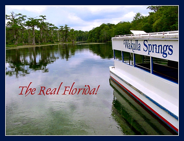
First: the subject. To choose this boat was a very good move. It fits perfectly the theme, and has a touristic appeal which makes you want to go there and/or makes you feel like you are there. This is what a postcard is meant for! So very good choice.
The composition is maybe the main reason why this pic works well. The angle you chose to capture the boat makes me feel like I was about to embark. 2/3 of the picture is filled with water, which totally makes sense here since it is finally the main subject. Maybe one thing to improve this composition though. It's been mentioned in the comments:
this image doesn't have the usual postcard proportions. I'm sure it would have looked much better with more rectangular proportions. Too bad.
The exposure is perfect. You wonderfully capture the texture of water and its reflections, while the sky is not washed out. Very well done.
The only reason I can think of why this entry didn't do better despite its undeniable multiple qualities is the lack of wow factor. Compared to spectacular night city lights reflections, this entry has less immediate appeal. But it is definitely very good and I wish you had done better with the votes.
I'd put that type in the lower-left. Actually, since this is a little too tall for a standard postcard anyway, you could leave the type but crop some from the bottom.
Good shot - as to postcard-ness, I think you could either have cropped just under where you've placed the text, or put the text lower down: it looks like a mistake being that far up the frame.
This is a good photo, the texture of the water is amazing! Well composed, nice combination of colors, I like it. The text, in my opinion, could have been placed more in the lower left hand corner tho.
I love how the text almost looks as if it were writen in the water. The boat adds a touristy element; I'd rather look at this marvelous scenery that you've captured so well.





 Add photograph to your favorites
 Add photographer to your favorites

 Photographer found comment helpful.


