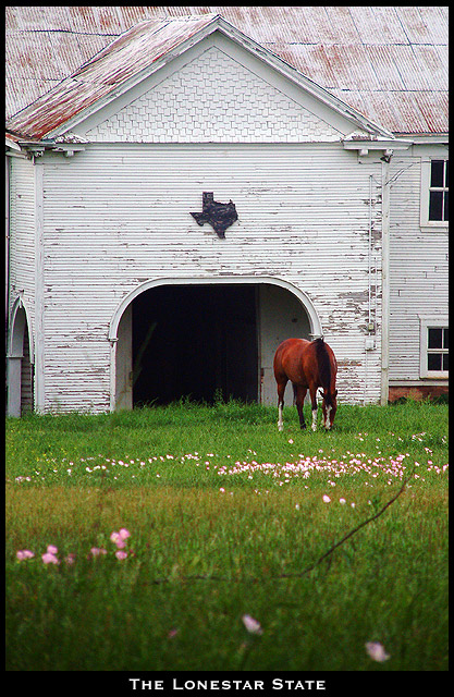
This is a small historical farm behind my house. I have lived here for 5 years and have never had a reason to go up the hill to see what they have, until now. I sat and waited with my tele for the elements to come together. I met the owner, Jay, and he let me wander around and get closer. I think that this image captures what the world thinks of when they think of Texas.
Statistics
Place: 35 out of 106 Avg (all users): 6.1545 Avg (commenters): 7.6429 Avg (participants): 5.9091 Avg (non-participants): 6.5652 Views since voting: 1328 Votes: 123 Comments: 15 Favorites: 1 (view)
i like the quaint and quietness of this picture. Shows a different, less "brash" side of texas. :) And the composition and DOF are extremely well done.
wow! great photo! i love the DOF and the colors. the out of focus foreground is perfect and really adds to the photo. the subject is very interesting and i think it's a perfect postcard. well done!
Very postcardy, and technically speaking a beautiful shot. The only thing that kept it at 9 and not 10 for me was a lack of a certain spung, that magic 'Wow!' spark. But I have to save 10s for *something*, right? :-> Really cute concept, too; I love the texas shape on the building. Cropped just right.
This photo has a very serene feeling to it. What a coincidence the flowers are the same color as the roof, it adds an effective touch to it. The darker area and the twig at the bottom of the image give me the impression you were shooting out of the woods, or laying on the ground so as not to scare the horse. Sniper tactics! Ummmm - 9.
very nice shot. i think you could have cropped off a little of the bottom as i don't think the picture benefits from having the very close grass/flowers in it (i assume you were trying to make sure the perspective/dof aspects of the photo were included, but in this case i don't think it works).
This has a lot of potential. A couple of things bother me though - I wish the horse had been lower in the frame, rather than right in the center of the shot and merging with the background. Second is the branch that is dominating the lower third of the shot.
The horse looks a little too red here to me. Also the branch lying in the grass looks like it oculd be a picture flaw more than just a branch. It might have been better ot move that branch. The text and the border are both very fitting, very postcard like. Overall this image is really good, with very minor nit picky details I'd change. Well done.





 Add photograph to your favorites
 Add photographer to your favorites


 Photographer found comment helpful.


