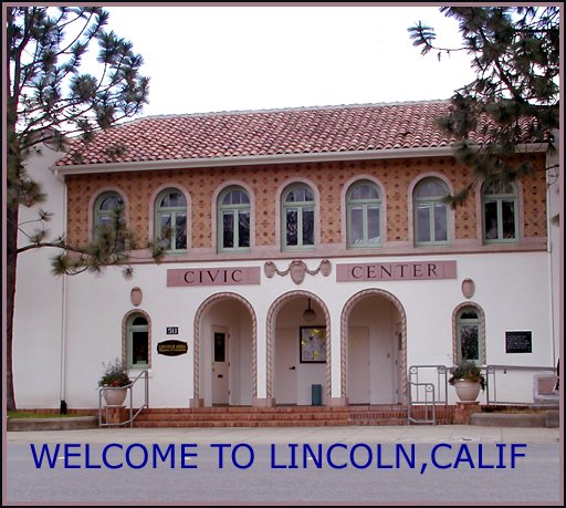
Although this isn't really a wow photo it does have it's good points. Using the trees on the sides as natural framing works well. The focus is good and the composition as well and the framing fits the image. I find that the saturation could be increased and that the blue text doesn't really fit to the pic.
To be brutally honest, the text color is horrid, and I'm not attracted to a photo of the Civic Center, although the pic is not bad, but it looks a bit over-processed and fuzzy.
i might have cropped in closer on the building since the sky wasn't that inspiring that day. i don't like the choice in font for the text, i don't think it matches the photo very well.






 Add photograph to your favorites
 Add photographer to your favorites


 Photographer found comment helpful.


