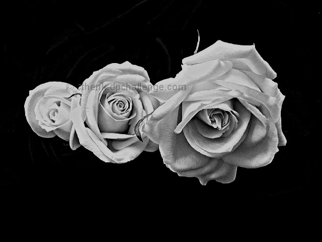
My neighbor went away for the weekend and gave me these roses she had so they wouldn't go to 'waste' while she was away. They are actually a very light coral/pink color. So for the contest I wrapped an old black curtain/scarf around the vase and counter while they were sitting in the bathroom sink. Voila! - well, I hope 'voila', I never would have thought to try this if it hadn't been for this site, so even if it doesn't do so well atleast I learned 'something' ;)
Statistics
Place: 11 out of 153 Avg (all users): 6.5359 Avg (commenters): 7.5667 Avg (participants): 6.4956 Avg (non-participants): 6.5726 Views since voting: 2161 Votes: 237 Comments: 32 Favorites: 8 (view)
Unlike some!, I have also a love for flowers, especially roses. Reason why I rated this photo as a 10. Because there is nothing else but 3 roses, I think it's actually good to center them. I also think you did an excellent job. Will have to try myself!
The effect here is almost "oil painted". I trust these are "real" flowers (I will assume that) so GREAT JOB!!! Almost surreal. (It this is really just a photo of an oil painting, please reduce score by 80 %) Photo 10 Creativity 8 B&W 10 total 10 (very, very good)
I like the contrast and texture... they almost appear to be made of paper. I like the progression from bud to full bloom. They are captured in time this way, where as in color the "freshness" is assumed to soon pass. Here they are captured in a memory. I'm babbling, but I just had to tell you how it makes me feel.
Nice high contrast. To me it seems a little dull though... roses like this are on wallpaper, handbags, sofas.... It's very hard to look at them, arranged like this, and see something exciting.
Is this really a photograph? Looks like either a photo of a drawing, or a pencil filter in post-processing. Assuming you're legit, it's very interesting. How did you get the background to underexpose so perfectly under such diffuse lighting? The centered composition is a bit static - maybe cropping up from the bottom to 427X640 would give it a little more life.
interesting photo... the total darkness around the roses seems to be a little strange when roses are generally bright, nice, and soothing to look at... good photo!
Yes they are. Very nice contrast. The only thing I can see that might be distracting to some is the stems in the background. I am familar with this problem mostly, because I wasn't totally successful in making my background "disappear" this week either.
wow.. I love this. I'm also gonna say email me after the contest and tell me how you did the background so dark. I've been trying to figure that trick out.
I'm sure you'll get "but why would you take a b&w shot of a flower" kind of comments (I am for my flower shot). I think if there's contrast and texture in the shot, b&w can work well, your photo is an example of that. I would probably not place the roses in the middle of the shot though, I'd prefer to see them in the bottom right hand side for example. Also, the rose on the left seems slightly blown out - would it have been possible to adjust the lighting for that a little?





 Add photograph to your favorites
 Add photographer to your favorites

 Photographer found comment helpful.


