Before I get started on this particular picture, I must admit that I enjoyed studying your work as a whole. When I critique for the club, I like to take a look at everything I can to get a feel for the photographer before I start writing. I found myself to be impressed by your artistic eye. You are able to try new techniques and style to each photo with amazing results to make you a well rounded photographer. You inspire me. I am especially drawn to how you are able to capture color so well. The flower pictures in your portfolio are perfect examples. The colors are so vivid and rich, they literal pop out of the screen at me.
Now onto the task at hand...your beautiful postcard! During the challenge, I scored this a 9.
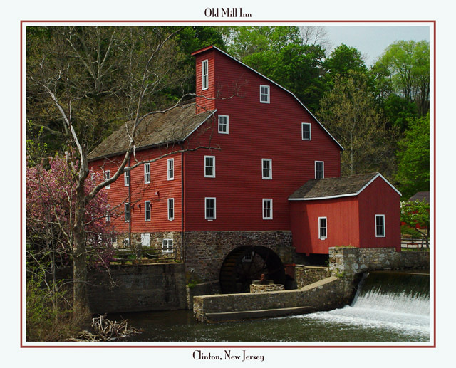
Composition: I really like the way the building is centered in the photograph. Yes, it would be nice to see more of the waterfall, but the building is the main subject and there is enough of the water to complete the picture. If you would have moved the shot a bit to the right, I'm thinking that it may not have been as nice. It doesn't really look like there is anything interesting to the right of the building. Of course, not knowing the area, I don't know that for sure...just guessing.
Technical: Once again, I'm impressed by the way you are able to bring out the colors in your photography. As with your other photos, the colors are vivid. The lighting seems nice, however, I would have liked to see the water wheel better. It is in the shadow of the building and doesn't stand out very well. Judging from the position of the sun and what appears to be moss on the rock around the wheel, that part of the building may not get the sunshine and good lighting in that area may not be possible for it to show up well in a photograph.
The reason why I voted a 9 instead of a 10 is the lack of clarity. The building seems just a tad blurred. When looking at the windows, my eyes tend to ache wanting to focus them in. Perhaps just sharpening the edges just a little would give them more clarity. Just because my curosity got the best of me, I did take your photo and simply sharpened it just a little in my program and it did work. It even managed to bring out details in the water wheel to make it stand out better. Try it and see what you think.
Challenge: This is definately a nice postcard subject. The photo is well framed in the postcard size and the border is appropriate. Not only was the subject the reason why I voted this as high I did, but also the way you used it in the postcard. You chose an excellent font for the text and provided the necessary information on your card to let the recipient know what they are seeing.
Congrats on personal high score for you on DPC. Well deserved.
I hope you found this critique helpful. Please feel free to notify me if you would like to discuss anything further.
Congrats, Terry, on a top ten finish and DPC "Personal Record" 6.864!
Again, this was one of my top three picks for this challenge. The reasons - Excellant composition, color, framing and exceptionally well suited for this challenge. It is simple and elegantly understated; exactly what a quiet, rural community would want.
I really loved this shot. The deep rich red of the mill is a very nice contrast to the greenery around it. You did a great job of composing the shot also as it is well balanced.
Very interesting land mark. I think I'd like to see a bit more of the surroundings to give it more character. Would be nice to see a bit more of the falls onthe right. Still very effective. Jacko. 8
The text at the top looks kinda out of place to me, but the photo is very good. I've never been in New Jersey, but this photo makes it look like Clinton is one of the places to visit over there :)
This picture is fabulous! Looks great! The border is perfect as is the text, very fitting. Overall well done! This is fabulous and a pleasure to look at.






 Add photograph to your favorites
 Add photographer to your favorites

 Photographer found comment helpful.


