Author Thread Comments Made During the Challenge
Post actions
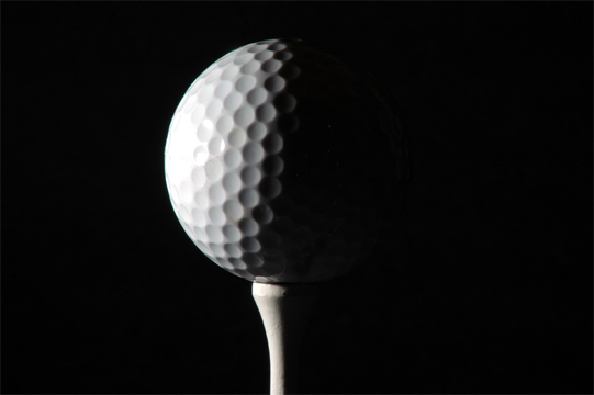
good b/w tones... good texture except for the washed-out part of the ball. nice concept which can be a good advertising photo.
Post actions
Post actions
Beautifull;y done. Very minimalist. Very austere. And very effective at using light and shadow to convey texture.
Post actions
blown out highlight spoiles, not a great texture subject
Post actions
This image appeared really dark. It is also very grainy on the portion that is lit. I have found that using a smaller file at the time I take the picture helps to really cut down on the grain.
Post actions
seen shots like this before but still good,,,,
Post actions
Post actions
Simple and efffective - I like it.
Post actions
Fits challenge=5
Post actions
The shadow effect is very nice and black and wht was a good coice
Post actions
I love the lighting on this one, it really makes this photo stand out...wonderful photo
Post actions
Post actions
Very nice. The left side of the golf ball is just a tad overblown. Nice use of light to bring out the dimples
Post actions
nice light and shadows; 9
Post actions
lacks sharpness. From the soft focus, I would not get the feeling this was a hard golf ball - but a softer ball. Hope that makes sense to you.






 Add photograph to your favorites
 Add photographer to your favorites


 Photographer found comment helpful.


