Rotated, levels, color adj, cropped, resized, added text.
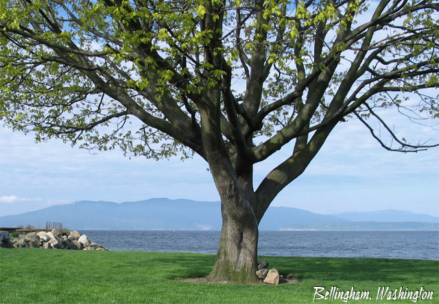
This is one of my (and my dog's) favorite scenes in B'ham. It may be boring to you but this tree, standing guard over the bay, has always fascinated me. Had a frustrating time trying to capture this. Never could do it with the old camera and still can't do it with the brandnew G3.
Statistics
Place: 54 out of 106 Avg (all users): 5.7886 Avg (commenters): 7.0000 Avg (participants): 5.7200 Avg (non-participants): 5.8958 Views since voting: 1043 Votes: 123 Comments: 10 Favorites: 1 (view)
It does look like a postcard, and I also adore the composition. Technically speaking, a beautiful shot. The only thing that kept it at 9 and not 10 for me was a lack of a certain spung, that magic 'Wow!' spark. But I have to save 10s for *something*, right? :->
Interesting shot. Good job at fittin gthe moutnains, ocean and tree together. I think it might more effective the tree was even more off centre. Jacko. Good luck.
It almost looks like summer there! This is a prettty decent postcard pic, everything's in focus and the writing fits in well and doesn't distract the eye at all. Personally I wouldn't have centered the tree as much as you have though. The decision to crop the tree like you have was a good idea.
I would assume that this tree bespeaks the essence of Bellingham? It is nicely placed in the composition, though I wish your colors everywhere were a tad richer.
I think it would have been nicer if the tree would have been further to one side, instead of being just off center. Maybe cropping of the unidentifiable things we see to the far left.
beautiful location, however the DOF needs to be adjusted. the leaves in the front, just above middle to left really take away. They keep pulling and holding my eyes.
Beautiful image. The centering of the tree in the shot worked really well. The text is very fitting doens't take away from the image at all. Well done.






 Add photograph to your favorites
 Add photographer to your favorites


 Photographer found comment helpful.


