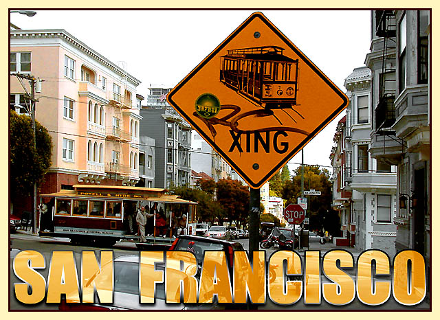
On first impression, this is a striking postcard. The text jumps out at you, as does the street-sign with graffiti. It was a daring move on your part to use this photo for the postcard challenge!
Graffiti first: On the one hand, including it makes San Francisco more real, perhaps even more "likeable", more like a place where the common person would feel comfortable. On the other hand, I think it's highly unusual to include a sign with graffiti in a postcard - and this cost you in the challenge. For myself, I'm not sure; I like it, then again, if I were a tourist in San Francisco I would think, "Well, that's a shot I can take myself, why do I need to buy it in a postcard?"
The grey sky is also daring - most postcards seem to aim for the perfect blue. You didn't. I must say, the grey goes beautifully with the buildings on this street, and gives the flavour of the city better than if it were blue. I like the light - the street is for the most part in shadow, but still bright. Nice.
Focus also is good, actually, there's hardly anything out of focus in this picture, just the trees and buildings in the way back.
The text is beautiful, bold, appropriate. And the lighter border (of the card, not the text) softens it just so.
My nitpick: the streetlight in the top right hand corner, I think I would have tried to keep it out of the photo.
Excellent postcard! Two issues in the awe too bad catagory, the graffitti on the sign and the hazy day....oh, damn. I really like your tranparent lettering. Catching the traincar in the frame was a great (but necessary) element. 9 Rob the Swash
Very postcardy, and technically speaking a beautiful shot. The only thing that kept it at 9 and not 10 for me was a lack of a certain spung, that magic 'Wow!' spark. But I have to save 10s for *something*, right? Also, it'd have been better if the sign'd been pristine/not graffitied. In the Land of Postcards, graffiti only exists if it's cute and artsy. :->
Lived in San Francisco for decades. Tragically the cretin vandal \"taggers\" are everywhere like horse manure...with the same intellect. I like your photograph - it catches a moment of a great city. Crisp, good color...brings memories.
the crop seems a little tight at the top of the sign..maybe a another few millimetres of sky above it? Also, the graffiti on the sign is really a shame, and takes away from the "beauty" of the scene.
I think the sign is a bit too big and the graffiti is distracting. I think the shot would have been better if you would have focused on the cable car. Nice job with the font.
This makes me think of SF in the rough.... It really is a place with a lot of grit to enhance the texture of things. Your inclusion of graffitti was clever!
I really doubt a sign with graffiti on it would be chosen for a postcard - I like the overall concept, but a different trolley crossing sign would have made the photo better.





 Add photograph to your favorites
 Add photographer to your favorites


 Photographer found comment helpful.


