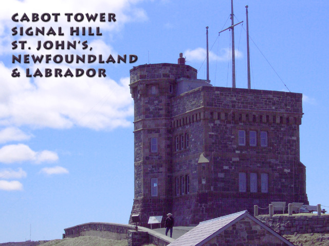
Signal Hill in St. John's, Newfoundland and Labrador, Canada is the North American site of the first transatlantic wireless tranmission by Marconi. Cabot Tower is a commemorative building in honor of Queen Victoria's Diamond Jubilee and the 400th Anniversary of John Cabot's discovery of Newfoundland. Here are some links for more info for those who are interested: //www.nlta.nf.ca/HTML_Files/html_pages/publications/edwk2001/wwques.html
//www.education.gov.nf.ca/dis_hist_cabot.htm
Statistics
Place: 97 out of 106 Avg (all users): 4.8306 Avg (commenters): 6.0833 Avg (participants): 4.6494 Avg (non-participants): 5.1277 Views since voting: 1386 Votes: 124 Comments: 13 Favorites: 0
The story behind the site you photographed is quite interesting....
I don't know if it would have been possible or not, but a different perspective could have made some improvements in this shot overall... the small building top in the lower right side of the frame is a bit distracting... I'm not sure if you had a way to remove that by shooting from a different angle or not.
The antennae on top of the building also seem to feel a bit odd with the center one cut off by the top of the frame....
The image also has an overall blue cast to it. It looks almost like the image was shot using an indoor white balance mode. Some color correction with photoshop may have been able to clear this up.
As a postcard theme, I think you have a good subject, but I would definitely look for an alternative composition if possible...
I like the inclusion of the man in your shot, has a great feel to the shot. The building seems a bit dark and purple to me, but I think it might be my monitor, if it is indeed dark and purple, maybe a fiddle in PS would have solved? :)
Great subject, great composition, great clouds behind (and the one person wandering up the path makes it particularly postcardy). However, the color balance in general is weird. The castle isn't meant to be that kind of dark bluish purple, is it? I would assume a brighter sort of brownish shade was intended. This was *almost* a 10 for me, but the colors make it look like it was shot with 200-speed Fuji film and not cleaned up afterwards, moving the total feel from 'postcard' back to 'snapshot.'
Great job, so a great grade of 10 from one Canadian to another. Good luck in the challenge. I love St. John's and the Avalon too. My mother is a Walsh from up the shore in Feurmuse. Morgan
The roof in the foreground is a distraction; there is also a distinct blue cast. I like the framing (sans the roof, but of course easy fo rme to say, not knowing how accessible the area is!)
nice choice of font and a good timing for taking the image.. I like the fact that the human being is at the right place in the overall composition. The font works well with the overall intent of the image. Perhaps it is a too close to the tower..that part is a little disturbing.6






 Add photograph to your favorites
 Add photographer to your favorites

 Photographer found comment helpful.


