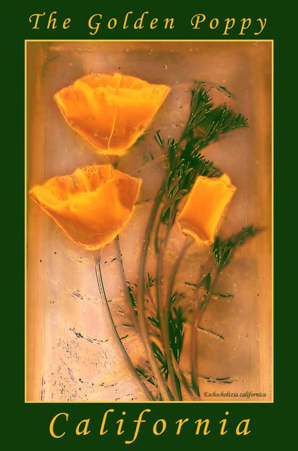
I am not sure what the response will be on this image. I decided to go for the art look again. It has been raining in sunny California this week, not too good for a postcard.
These are the steps I used to achieve this effect:
1. NeatImage (heavy noise removal)
2. Levels
3. Curves
4. Gaussian blur blue channel
5. Unsharp mask green channel
6. Selective color - absolute method, (I did a lot of tweaking here).
7. Hue/saturation
8. Variations
Everything I did was within the boundries of the rules.
Statistics
Place: 52 out of 106 Avg (all users): 5.8537 Avg (commenters): 7.7059 Avg (participants): 5.6892 Avg (non-participants): 6.1020 Views since voting: 1608 Votes: 123 Comments: 23 Favorites: 0
Hi Todd. This was one of my favourites in the postcard challenge and I was very astonished to see it way back at place 52. You postcard turned out beautifully and is exactly the kind of card I see in postcard stands everywhere.
The digital art aspect of your submission is the reason it was placed so far down the line. For some reason digital art doesn't come over too well with the majority of DPC voters, even if it is a fine work of art like this is.
Thank you for posting your original shot of the flowers as well as the steps you took in the post processing phase. This not only works as a kind of tutorial, but also shows me the amount of thought and fine tuning you put into your postcard.
To the photo itself, the color combinations are amazing (could also be a good secondary color challenge submission). Your choice of backfround, border and lettering couldn't have been better. This image is a pleasure to look at. Congratulations on an excellent submission which was unfortunately extremely underrated.
Thanks for the comments. I will still submit the "digital art" types of entries. I really liked this one. I do understand that it blurs "digital art" and photography.
However, The shot was taken during the challenge week and all rules were followed.
I arranged the poppies on a glass candle holder, sprinkled with water and took a few shots with different exposures and metering.
The PS7 steps I took are with the submission.
Chris- here is the original image:
//www.dpchallenge.com/image.php?IMAGE_ID=21428
I also agree that this one should have done better. I'd love to see the original image. If the original is really an image of real poppies, this is amazing given the rules.
Have to agree with kiwiness. I've only looked at the thumbnails of most entries to this challenge, but this one sure stood out. Personally I can't understand this discrimination against digital art.
Weird effect you got, but it's beautiful. It doesn't look like a phograph any more. You must have used a lot of filters or something? The result is really interesting. I'd buy this postcard!
An absolutely stunning work! This as professional as anything I have seen on DPC in the past twelve months. Quit your day job...pursue this field. 10 JEM
The distortions to the image are kind of precious, in a way that annoys me slightly, and worse than that, in a way that's not very postcardy. It *is* pretty, though. If you'd just not messed with it I'd probably have marked it 10.
This is a rather nice work of art... Whatever post processing that has been done to it makes it look more like art than photography. I find this one difficult to judge as 'photography' because of that... it sorta crosses the line between photography and digital art for me...
I'm not sure how you achieved this effect without an image altering filter, but this looks fabulous. Looks just like a post card, The colors are awesome together. well done.






 Add photograph to your favorites
 Add photographer to your favorites

 Photographer found comment helpful.


