Author Thread Comments Made During the Challenge
Post actions
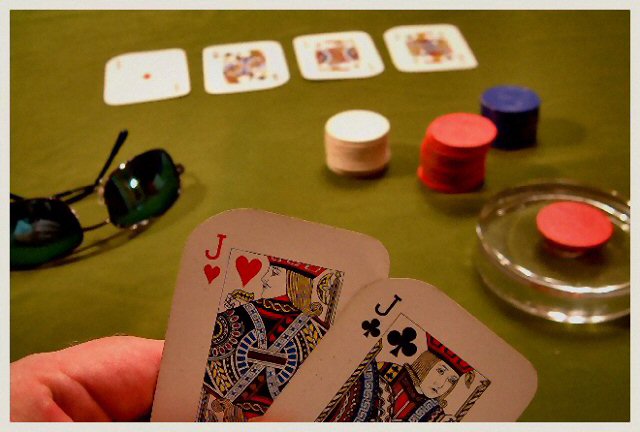
I'd have liked it better without the RayBan's in the photo.
Post actions
Interesting idea. The lighting kills it.
Post actions
I like the concept, but the colors are off.
Post actions
1 - DMC - No discernible effort here for the challenge. Nothing 'sporty' about this - it is a game. No action even at that.
Post actions
I would prefer a higher DOF
Post actions
Seems a little bland, but I like the idea.
Post actions
And you flopped two more. Beats the other guys 3 kings. 7
Post actions
Interesting. DOF is nice. Seems fuzzy. Why the glasses.
Post actions
Post actions
game not a sport to me. I think there is a difference.
Post actions
composition: 1/2
Post actions
Post actions
Could use a bit more green. Tone down the red hues.
Post actions
Illegal to play poker in Iceland, but it looks like fun. This picture is a bit unclear in the front that makes it loose touch and the position of the glasses makes it a bit unstable.






 Add photograph to your favorites
 Add photographer to your favorites


 Photographer found comment helpful.