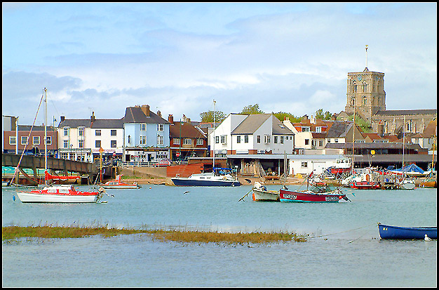
Nice picture...sharp on the Village..text as a postcard missing... maybe a crop at the top of the blue boat down, replaced with a text describing Shoreham..
Mark (this has to be you, doesn't it?) - what i really like about this is that it has the slightly over-exposed quality that so many postcards have (few shadows, very bright, no moodiness), and that you've cropped it to pretty much the right dimensions. You get a 6 - though tbh I haven't really decided what I'm looking for in the challenge - 'typical' postcard, or one that I'd buy ... Could certainly imagine this in one of the shops by the harbour there, or scribbled on with 'our holiday flat' and an arrow in biro.
This looks like a typical English coastal town postcard shot, well thought out! The composition you chose is appealing and what strikes me immediately when I look at this image are the many different tones of light blue in it, good one!
The reds seem to be very oersaturated here. The image is nice in perspective, but the colors and details seem off. The border is nice nad this shot could make a good postcard, but the color is too saturated.






 Add photograph to your favorites
 Add photographer to your favorites


 Photographer found comment helpful.


