Fit Challenge Criteria: 2/2
Color/Contrast: 1/2
Composition: 1/2
Photo Quality: 0/2
My Subjective Affinity: 0/2
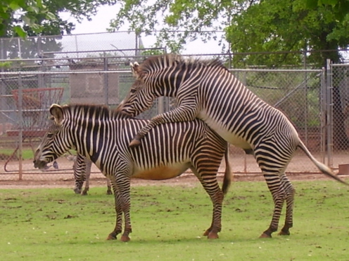
The fence in the background is distracting. The sky is blown out. The colors are all a bit too weak. The zebra in the background is distracting. And there could have been a little more class in the photo. This is more somethin you would see in a comic section than a photograph contest. Better luck next time.
Since I am lacking in technical skills, I cannot give helpful comments. I am strictly a photo buff who is trying to improve, but as to telling you what is wrong or right, I am in no position to say. I am simply voting based on whether I like the picture or not. Sorry, maybe someday I will be able to give helpful advice






 Add photograph to your favorites
 Add photographer to your favorites


