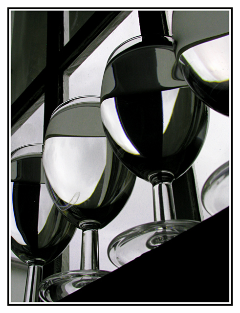
Cool shot. I like the contrast between the lines of the window and the curves of the wine glasses. And the bending of light and shape adds to the interest of the image. Nice composition.
Good set-up. This image looks very focused and detailed. The refraction brings in an enhancing effect and somehow I get a feeling of cleanliness when I look at this photo, don't ask me why. Maybe because my wife got me to wash our windows yesterday :-)
I really like the abstract nature of this - it's like those drawings where a kid draws lots of curvy lines across a page and colours in random segments. Except the composition here certainly doesn't appear random. I like the dark diagonal framing areas to top left and bottom right. The curves within the glass and the different liquids are great against the straight edges of the window frames. The unusual viewpoint is also appealing.
In my top 5.
9, Kavey
Very good entry in this challenge. B/W is a good choice. The only thing that bothers me some is that the second from left glass looks like it's dirty, or has a watermark?
Very striking shot! Very nice!!! A couple of distractions, though... one is the flaw in the bottom of the one glass.... the other is the border. It takes a bit too much away from the shot itself, in my opinion. --9
Wow - what a great idea for a shot. I'm inspired. I always try and look at a shot from every possible angle before I take it, but its so easy to forget to look from the bottom up!. A+ for creativity. The high contrast also works really well with this shot - very dramatic. 10
I already voted and commented on this one...guess it didn't take. anyway, what I said before is that I really like your setup/composition...it's just too bad thesecond glass from the left has that mark on it...I can't tell if it's a stain or a reflection, but it messes with the otherwise perfect clarity. nice shot. 8. Pedro
Real sharp and clean (except the out of place mark on the second glass from the left), great contrast with neat lighting effects in the glass/water. Great job!
This is a great image. What they heck is that crud on the bottom of the second glass in? Really hurts this shot IMO. Dammm Spot editing rule should be removed for things likee this... Great job...
I like the unique-ness of this photo. I like the angle at which the glasses where shot and the lines of the window panes. I do think, however, this would have been better to be in true black and white. There is color along some of the edges that I feel takes away from the quality of the shot.
The focus here seems a bit off. There's also a watermark type stain or something on the 2nd from left glass which caught my attention right away. I like the contrast in this shot, and I like the idea. The perspective is also great. The framing looks good and is very fitting. Overall well done.
If this doesn't win a ribbon, then the voters here got issues! Incredible picture. There seems to be a little distraction in the glass that is 2nd from the left, other than that....PERFECTION!





 Add photograph to your favorites
 Add photographer to your favorites

 Photographer found comment helpful.


