Author Thread Comments Made During the Challenge
Post actions
Post actions
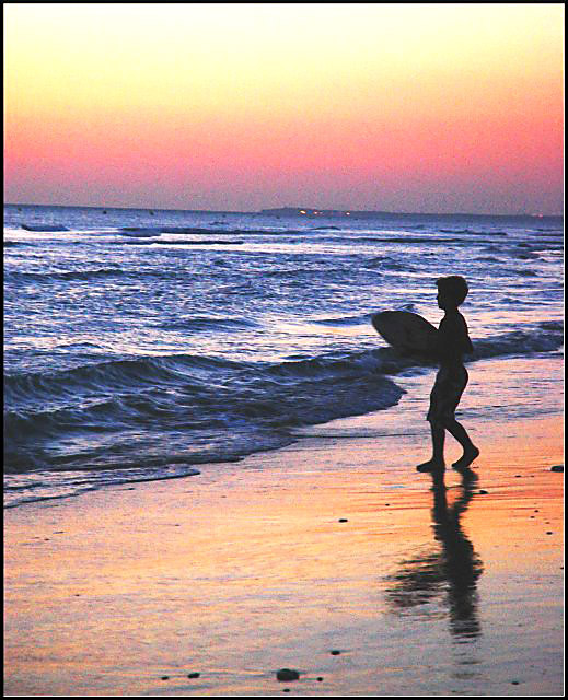
A little too noisy, but lovely image all the same. 6
Post actions
Great color. Looks like the horizon is sinking, though.
Post actions
Colors are great, pity about the grainy/noise effect which could be as a result of too much exposure and contrast manipulation
Post actions
pretty but very noisy. love the sun relection on the sand
Post actions
me and my wife both agree, we like this photo best minus all the noise. I dont know if you did this on purpose, but despeckle would of made this image the winner in both our opinions.
Post actions
The colours are good and the silouhetted figure seems well placed however there is a lot of colour noise in the sky and the horizon has a very noticable tilt.
Post actions
Not sure if you were after the grainy effect or if it happened from overprocessing. The horizon is a little tilted. Nice colors and composition.
Post actions
grainy and over processed imho
Post actions
I like the colors of the sky and how it's reflected onto the beach. It does look grainy though. Still Nice shot.
Post actions
Nice colors, but it's a little too grainy - and the horizon seems a bit off.
Post actions
The silhouette works well in this shot. Your horizon needs to be leveled and the quality seems a little grainy on my monitor.
Post actions
this has the makings of a fine photograph, but could use a little work. you've probably been told that the horizon is tilted and that it either looks oversharpened or too noisy or not sharp enough and/or that the border wasn't applied evenly. just don't take any of it (especially your score) personally. just keep on shooting and submitting, and you will get where you want to be!
thread for some more pointers on how to score higher. good luck!
Post actions
A bit too grainy for my liking, but a great silhoutte.
Post actions
Sky is a little grainy but overall the picture works well for me. Comp is ok I would remove a little of the top sky exp seems ok if this is what you were trying to accomlish
Post actions
The noise is overpowering the subject.
Post actions
A bit too much saturated but nice :)
Post actions
Not sure if the noise adds to this pr not. It gives it a nice vintage look, but still... maybe a tad too much.
Post actions
Very nice use of color but also very grainy.
Post actions
very grainy, lots of color, no action.
Post actions
I love the colours and reflections but I think it would look better without the grain.
Post actions
wonderful capture, the colors work for me
Post actions
This image would have been better if the horizon wasn't tilted.
Post actions







 Add photograph to your favorites
 Add photographer to your favorites


 Photographer found comment helpful.


