This going to be a very short critique, as your postcard is just right, I wouldn't add or take away anything, it's fine the way it is. I read the comments below, to see if I could pick up something to say besides, "Great postcard!", but, no luck.
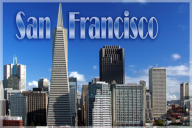
I love the colour of the sky, the clouds close to the horizon line, the angularity of the buildings - it's a dynamic shot. The shadows on the buildings make it more human. This postcard tells me that I wouldn't want to go to San Francisco to spend a relaxing time by the lake, but I'd go there to DO something, something fun and interesting.
OK, before I type up a bunch more superlatives, I'll quit. Keep up the good work!
Thank you all for your great comments and votes. This shot was taken from the roof where I live. Made some adjustments in PS (levels, contrast, saturation, unsharp mask) and added a text using the Broadway type.
The use of text here clearly enhances, rather than detracts from this shot. The border does well to stay out of the way of a clear, bright and superb shot. Excellent work. I wouldn't change anything - 10.
Oh, you have done such a fine job with your photograph...as a long time resident, NEVER call it Frisco. Looks like a brilliant Spring day - with a long lens.
Love the geometry of this shot. It's all about triangles and squres in my eyes, not just buildings. Loeve the text. Really goes well with the image. Jacko. 9
I really like how you placed the tall building and I like the transparent border. The text works well also. The only bad thing I can see is the lower shadows on the buildings to the left, but that is nitpicking. GREAT postcard!!!
Excellent shot and font. Where did you take the shot from? This one will win most likely because it's such a typical looking postcard. Absolultely excellent, I'm jealous. 10.
Perfect time of day for this shot. The shadows accent the buildings and the blue sky with the white clouds make a nice accent to the skyline. 10 -danny
On a cloudier day I'd say that text would be very fitting, however with a nearly perfect blue sky that text seems very out of place in this picture. A gradient with more blue in it might have looked better... The image itself looks great. The only bad thing about it si the sahdows on some of the buildings, a different time of day might have corrected this. Overall I'd have to say well done. it loooks good.





 Hi there! Greetings from Frisco!!
 Add photograph to your favorites
 Add photographer to your favorites

 Photographer found comment helpful.


