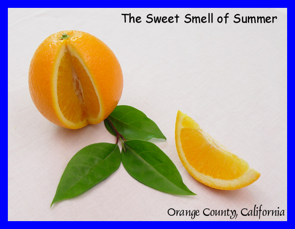
Challenge:Postcard (Classic Editing*) Camera:Sony Mavica CD400 Location: My home Date: May 2, 2003 Aperture: auto ISO: auto Shutter: auto Date Uploaded: May 2, 2003
This is a wonderful photo of my home county growing up a young teenager in So. California. With your masterful lighting and magnificent composition and arrangement of objects, this image gives me a refreshing, light, jublilant feel. And I'm pretty sure that's what this photo is saying about Orange County: that it's a refreshing, light, jubliant place to be. So I think this makes a fantastic postcard; it sums up Orange County rather well, and you did it in a unique, original way, avoiding the normal landscape photo.
Everything about this photo is great. I really can't say much to improve it. Sorry! Some folks mentioned the blue border as being distracting, and perhaps a blue that matched the soft bright tones of the orange and green would have been better than the very bright blue you have here. I noted the font below, and I suppose it is true that Comic Sans is a bit overused these days, but these details have little to do with the image itself, which is really well done. You might try fiddling--only a teensy-weensy bit--with the contrast to make that lower orange section pop just a bit more, but if that touches your wonderful lighting or clean background, leave it alone!
This is possibly your best work to date, showing real skill. Everything came together for you with this one: light, focus, DOF, composition, arrangement of objects. It's all just superior. I'll have to get some tips from you about how to make such a clean, white background. My latest photos which attempted this always end up looking a little dirty.
Well, sorry I couldn't be of much help in terms of suggestions. It looks like to me that you did exactly what you intended. I imagine that some folks might have voted it lower because it wasn't a landscape--but that's why I liked it so much! Oh well.
I love this simple and beautiful composition. The colors are so sweet and pure. I don't care for the border. The color doesn't complement the subject, but that doesn't effect my scoring. :-)
i love the simplicity of this photo. beautiful, bright colors without being blown out. the only thing i would change is that blue border. it really doesn't do justice to the photo.
This is an excellent photo, very sharp and detailed. The lighting is bang on and the green and orange colors complement each other very well. I don't think blue was the best color choice for the border though.
Holy bright borders batman!! This is a nice simple composition with a very clear message. But I'm not real fond of the border that houses this composition. Still its pretty good.
Are ther eany oranges left in Orange County? ;-)
Nice clean concept. I like the framing. Not quite sure the border works as well as it could, maybe thinner?
The text doesn't match! The shot is very nicely done, good light. Maybe if you had been down a bit lower with the orange. The orange is tilted a bit. A very good idea, creative, unique work. Nice job.
I have no idea why you chose this colour for the border. It looks really out of place. Orange, white, or black would have looked much better! Its a shame because the actual photo is nice.
I don't care for the blue border on this one. A green border, or an orange border, or a white border or something might have worked a lot better. The blue border is very distracting from teh nicely done picture.
I really like the composition of your photo for your postcard. The lighting and color is nice. I feel like I could actually smell the oranges. The text is well placed and very fitting. The bright blue border really hurts it, though.
The font Comic Sans is very passe, and I'd advise you not to use it anymore. But barring that, this is a GREAT pic of my former home town (Irvine)! Great composition, colors, and a refreshingly original idea.





 Add photograph to your favorites
 Add photographer to your favorites

 Photographer found comment helpful.


