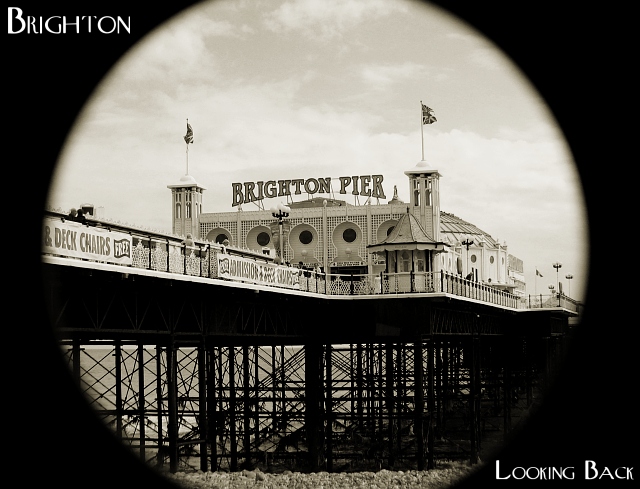
With the telephoto extension on and using wide angle my camera vignettes really badly.
Taking this shot without the vignetting shows too much - off to the right there is a fairly ugly bit of stone pier, and too the left there is a building. Using the vignetting eliminated them from the frame and created a much cleaner look.
Also, it gave me an idea for this theme.
Statistics
Place: 31 out of 106 Avg (all users): 6.2500 Avg (commenters): 7.3333 Avg (participants): 6.3797 Avg (non-participants): 6.0408 Views since voting: 1508 Votes: 128 Comments: 18 Favorites: 1 (view)
The quality of this shot is awesome. The exposure seems to be just right, and the focus is right on. It has a "rich" quality to it; the sepia really gives it a vintage feeling as well. I like the vignetting, it makes it feel like I am looking through a telescope or something. I've read through your comments, and really can't think of anything else to say to improve this shot. I found it superb in technique and composition, and it is a creative take on the challenge. Nicely done.
nice effect with the telescope sort of tunnel view, though I'm not sure its my favourite thing with that much black around it. I also like your choice of sepia, it goes with the captioning well. :)
Very postcardy, and technically speaking a beautiful shot. The only thing that kept it at 9 and not 10 for me was a lack of a certain spung, that magic 'Wow!' spark. But I have to save 10s for *something*, right? :-> It really does look like a genuine vintage shot, though, and major kudos fro that.
Very interesting image, I love the entire look from the slight sepia look to the filter used to obtain the appearance of looking through something. Makes me feel like I just stepped back to the about 1910.
I like the vignette effect; a bit more sepia tone would have been beneficial, of course that's a matter of opinion!
Could you have emphasized the clouds by adjusting color channels?
Overall, very nice image.
Lovely image with a great border. The font matches the tone and style of the architecture wonderfully. This is a superb B/W image. Raising the point of view would give us more of the fancy building and less of the pier structure and supports.
Wow, the vignetting effect is a GREAT idea and especially for this "old style" and feel post card. You should have used some old type fonts maybe. EXCELLENT! 8.
I lust love the old fashioned feeling your post card creates. The sepia toning comes through well. (You also get one extra point seeing I was born not too far from here!) But seeing I can't give you an 11 you'll just have to make do with a 10, sorry.





 Add photograph to your favorites
 Add photographer to your favorites

 Photographer found comment helpful.


