I think this image makes as good a postcard as any... It highlights an element of the community that would attract visitors. I don't think I can suggest any compositional improvements to the photograph....
As for the exposure, I think it may be just a tad under exposed. The color/tonal range looks just a tiny bit flat to me.
The text appears to be a little cramped also. In a postcard shot, it would be important to compose it in such a way that you leave room for any text that you want to add to the image.
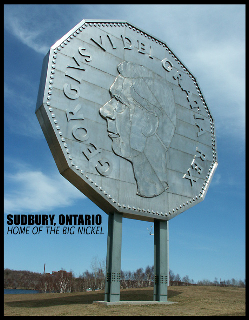
Now this is a typical postcard shot, you're on the right track here! You were lucky getting that crispy blue sky with amazing cloud formations in the background to increase the quality of you pic! I particularly like the perspective you chose for this.





 Add photograph to your favorites
 Add photographer to your favorites

 Photographer found comment helpful.


