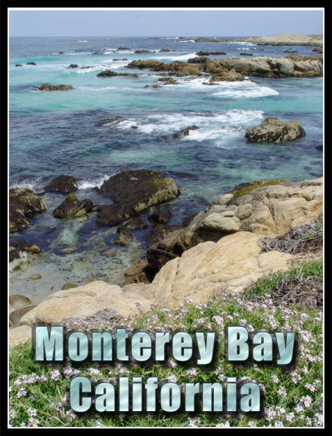
This is a beautiful scene... the composition is also excellent...
The text on this postcard seems to 'blend' just a little too much with the colors in the image. My personal preference in a situation like this would be to make that text stand out just a bit more if possible...
As for the photo, I think it's pretty good, but it just feels a tiny bit flat in the color/tonal ranges. I'm not sure if a level adjustment or a minor saturation bump would help this, but it would be worth a try. I would also make an attempt to sharpen the image just a tad also.
Very interesting shot with all those rocks sticking out of the water. Tells a lot about the area. Looks a little soft. I'd like to see the rocks a bit sharper. Good luck. Jacko. 8
Oh, how I love Monterey Bay.... You did a great job of capturing the little tidepools right there. Awesome shot, especially with those little flowers in the foreground.





 Add photograph to your favorites
 Add photographer to your favorites


