Fit Challenge Criteria: 0/2
Color/Contrast: 1/2
Photo Quality: 1/2
Composition: 2/2
My Subjective Affinity: 1/2
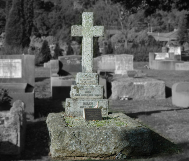
The selective desaturation is interesting. I don't know if it is appropriate on this photo. It doesn't make this grave stand out enough. There are not excellent whites in the photo. The background is quite muddy and the shadow on the grave is distracting.
I like the way you did the de-sat on this, it really brings attention to the subject but I think that the crop dissapated some of the attention. You might try bring it in closer on both sides. Also, the vertical lines all lean a little to the right which is a little distracting.
Interesting take on the challenge. The blur on the background enhances the view. I may have also darkened the background a little more, dimmed it so to speak to enhance the focus even more. Wish there had been a spot of color or something to draw my eye. Right now the image has depth but nothing really to hold my attention. 6 - Good luck in the challenge!
The gaussian blur is a little too much for this image. The shadow on the right side cast by the tombstone should have been a little softer. An interesting concept. Maybe it would have been more effective as all BW instead of your selective desaturation.
i am sure some people will not acknowledge this excellent pic in this challenge and that is really sad. such a great entry deserves recognition. from me, you get it. i love this pic.
The lighting here is harsh, causing the image to seem flat. A bump in contrast would help a bit. Also, another choice of composition to remove distracting items from the frame would have made a better image (house in bg).
Nicely done. I like the selective desaturation and blue. I think that seeing the writing on the headstone would be more meaningful, not only for this challenge, but also for the family of the person buried here. I'm thinking...get closer by sitting in front of the stone and angle up, keeping the focus on the words.
I like the single coloration and focus (I did a similar photo myself). Maybe crop out some of the surrounding area- it would still be effective and a touch more emotive in my book.





 Add photograph to your favorites
 Add photographer to your favorites


 Photographer found comment helpful.


