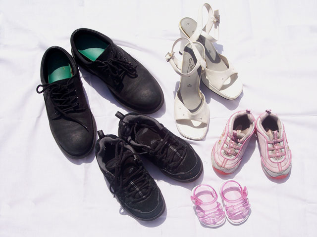
I like the idea for this picture. I think a different angle would help make the picture more exciting, as it is a bit flat right now. I also find the white overexposed and the detail on the dark shoes is lost. Maybe a fill in flash would help to bring out the detail in the dark shoes.
Creative method to express the idea of family. Perspective is fine. Your choice of shoes and colors complement each other.
This almost looks high key but might not be the effect you were after. The background either has to much or not enough wrinkles in it. Seems like the sheet should be completely flat so that there are no wrinkles at all or you should include more and strategically placed wrinkes to add texture and visual appeal to the image.
good idea. your lighting is very harsh though. i believe the shadows could have worked if only if they were alot stronger, so your best bet was probably to get rid of them with another angle of light(s) or reflector(s). the wrinkles in your sheet distract a bunch., and looks like they just could have been pulled out. the positioning of the shoes seems a bit safe, but definitely works. perhaps rearranging the postion of the pairings might have provided a more dynamic shot. upon further reflection just switching the brother and older daughter's might help break things up.
What's that smell? heh heh, j/k. Couldn't resist.
Great concept, nice selection of representative footwear, good arrangement and composition, just a bit overexposed. Good job overall.
Neat insight on the topic. I think the white background is a wee bit bright and maybe you could have positioned the shoes as if they were walking so that the smallest were first and the biggest at the rear. Neat though. 6





 Add photograph to your favorites
 Add photographer to your favorites


 Photographer found comment helpful.


