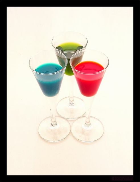
Not sure I like the angle of this shot. Also, the glass edges are not well defined. I think it would have looked better with a differnt background other than white.
An interesting idea but the emphasis seems to be more on the liquids than on the glasses containing them - the glasses themselves almost disappear into the background.
Beautiful. I love high key shots and this one is very well done. Placing the sujbect smack in the middle is a good thing. Very simple and effective shot. One of my favourties this week. Jacko 10.
I think this is a really strong image... I could see it on the wall of a trendy cafe.... is the backdrop cream? I hope so..... if not your whites are a little off.... but overall I think it is a strong image. Good luck, Todd.
A *little* less brightness, so it's clear that the feet of the glasses are feet of the glasses (and not disconnected little nipple-shaped things sitting on the background in front of short shot-glass style glasses) might have gotten a better grade from me. Still, very good shot.
was this your entry for primary colors as well? very simple, and technically well done. don't love your choice of color, but that's just my preference. Maybe a bit bright...part of the stems disappear.





 Add photograph to your favorites
 Add photographer to your favorites


