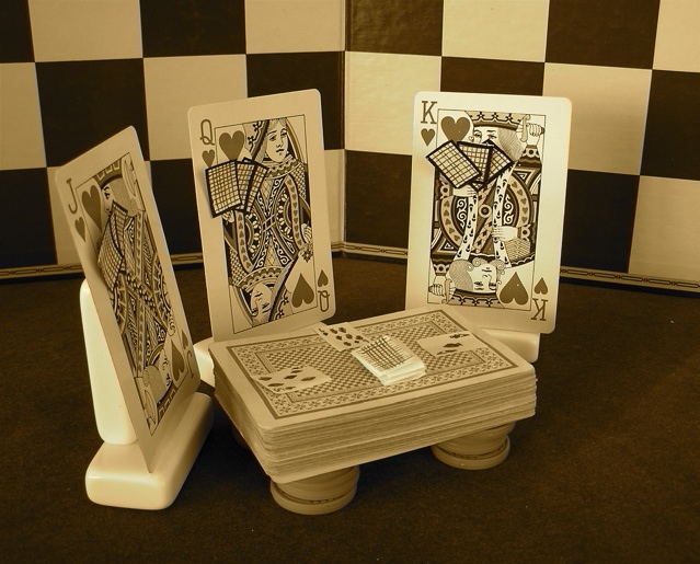
nothing spectacular in the setup. It just took a lot of work to make the tiny cards. I hope that people like the originality. I think that there's something funny about the angle or something, but I'm not exactly sure what's wrong.
Statistics
Place: 96 out of 159 Avg (all users): 5.0248 Avg (commenters): 6.3500 Avg (participants): 4.7407 Avg (non-participants): 5.1677 Views since voting: 732 Views during voting: 350 Votes: 242 Comments: 23 Favorites: 0
I'm not a fan of the coloring, it gives it a bland feeling when I think if the J Q and K were red the image would have a lot more impact. It might also help if the ground they were set on was more black.
I really like the idea though, it took a bit of staring to figure out what was going on ;)
I have viewed this 5 times now. I still am having trouble relating this to the challenge. I can see where you wanted to go with your concept, just didn't do it for me. Family does not come to mind. Well composed - yes. Good lighting and creative. Just not for family IMO.
Cute set-up here and such a neat idea. I don't really like the sepia or yellow hue, though. I think that desaturating everything but the red would have been neat and appropriate. This had to have taken A LOT of time to set up. Kudos and extra points for that and your creativity.






 Add photograph to your favorites
 Add photographer to your favorites


 Photographer found comment helpful.


