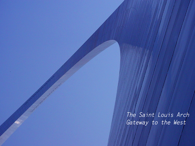
Challenge:Postcard (Classic Editing*) Camera:Sony DSC-F505V Location: The St. Louis Arch, Jefferson Memorial Extension Date: Apr 30, 2003 Date Uploaded: May 1, 2003
First impression: Wow, what a cool perspective! And all blue. The words are out of place.
Composition: Unique, different, great use of space. I've been to St. Louis, and up into the arch (long time ago), and this picture captures the feeling of the place very well.
Technical: Focus is good. I would have liked the contrast to be a bit higher (blues of sky vs. blues of arch). Wonderful how you got such a big blue sky with hardly any noise.
Overall: I wouldn't change anything in the picture, except (maybe) to brighten it up just a little. The words on the other hand look a bit "tacked on", and it's the words that probably cost you a higher score in this challenge. Please don't take this wrong, but the picture is bold, beautiful, it reaches out into the sky - the words look kinda "wimpy" by contrast. The good news, now you can experiment with it!
Keep up the good work! Take care,
Ursula I Abresch
BTW - not that I don't like your pictures, they're beautiful, but I hope you get someone else (for variety) on your next critique :)
Great composition! I would prefer a greater difference between the blues in the arch and the blues in the sky, but that may not be possible without masking. Also, I'd not use italics because the slant competes with the slant of the lines behind the text. Otherwise an excellent photo.
Not a bad idea - I've seen postcards with that sort of concept/setup. However ... there really isn't much contrast, at all. Everything's almost exactly the same color of blue, and nothing's really clear enough to give you somewhere to look. The text could also use to be bolder and postcardier, or omitted entirely (since as it is, it seems half-hearted and unsure, and just makes the overall effect worse). Maybe it's cropped too close, or the angle is slightly too extreme.
Sorry, just thinking out loud about how to explain my reactions. :->
great angle on an oft photographed landmark. :) I love the consistent blue tones as well. My only gripe is the font..its not adding anything to the style of your photo..still a great shot though!
Great angle on a very popular subject. I feel that the text doesn't quite match the flowing mood of the picture but the final product is great anyway. - 9
Amazing photograph, and one really feels the immensity of the structure. But I gotta say I really don't like the Text there. Mind you, I don't know where I would put it but...maybe just a diffrent color other than white... Other than that I love it.
nice shot, I like the visual impact while still representing an iconic landmark of the area. it would definately make for a good postcard. One thing I noticed though is a certain amout of 'grain' in the sky seems to be picking up a certain amount of red. Overall though I really like it.... 9 one of my faves this week.
excellent perspective on the arch... I think the blue cast works fairly well in this one but I would love to see it the other way as well :) - nice work...
Wonderful composition. You really capture the essence of this structure here. I love the striking curve and the subtle colors. The font is a bit dull, but it doesn't matter much.





 Add photograph to your favorites
 Add photographer to your favorites


