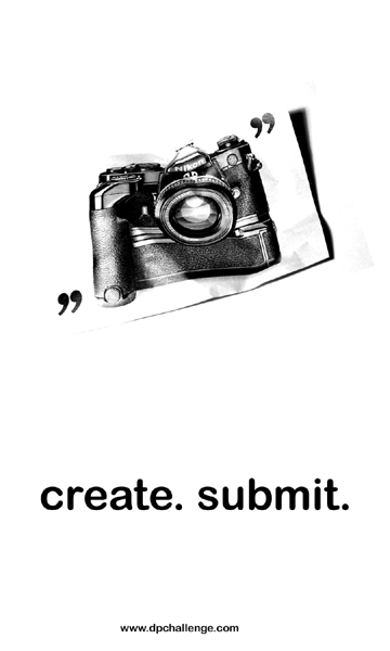
I cut the camera out of an old magazine ad and crumpled it a bit, then shot it against a white backdrop. I bumped up the brightness and contrast in Photoshop to get the white I wanted, and to burn out the top/left edges.
But I think this would've worked much better with a crumpled image of a yellow flower against a blue sky for example. Something a bit more lively than the camera ad.
yes. you definetely got ripped off. This is by far the best one (other than the original logo of course, which is why i didn't bother submitting). Great job.
I really like the \"create. submit\" tag line. Simple composition would work well on a sticker. I don\'t quite get the image. Maybe try another photo to enhance the other aspects of a very good entry. Still an 8.
I love the style of this one. It is simple, stark, but also attention getting. I'm not sure if it gives enough information (something about digital photography or a contest might have helped) to draw in a good potential user, but I love the general appeal of this. 9
I really like the basic design of this sticker. The crumpled camera photo is great. I'm a little unsure about the quotations and choice of font but I think the simplicity and layout are great.
I thought the rules said that it should be the other direction ("5 inches wide by 3 inches tall "), but I like this layout. Effective and simple. The web addy is too small though.






 Add photograph to your favorites
 Add photographer to your favorites


 Photographer found comment helpful.


