Author Thread Comments Made During the Challenge
Post actions
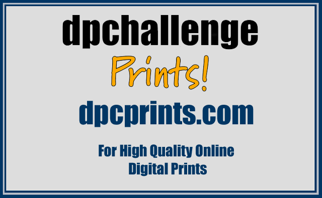
Sharp, crisp, to the point. Good job!
Post actions
I like the tag line at the bottom - tells what the site is for. A little to evenly spaced. Mybe put the "For... " on one line and neat the bottom.
Post actions
This would have been better represented with some image being used as a backround.
Post actions
A clean design, but I think you have room for a little more detail (without becoming overly busy like my entry!)...
Post actions
I think some visual images would have enhanced this overall.
Post actions
Post actions
To the point! Simple colours. Fonts match those on the site.
Post actions
Very simple, I like that it's easy to read. I think blues and greys compliment each other well. I wish there was some kind of art, picture,, anything - to draw the viewer's attention in the first place.
Post actions
To me this looks like it should all be centered, but they are all slightly off in different directions. I like the simpleness of it but I think it needs a little something else to give it more impact.
Post actions
Well done... Says it all simply and clearly.
Post actions
It's too boring. I applaud you for trying however! Good effort!





 Add photograph to your favorites
 Add photographer to your favorites


 Photographer found comment helpful.


