|
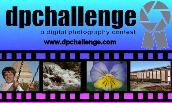
I like this one but... although the pictures are good (nice and \"well-rounded\"), the one on the right (a barn?) is really bad. You can\'t even tell what it is. You should have used a Train or Boat instead. Should have made the ribbon bluer. I really like the structure of this one and the background also. This could be a winner with a few \"tweaks\". Also, make the URL stick out more (color, whatever) and left-justify it with the "a digital.." logo. Good job! |






 Add photograph to your favorites
 Add photographer to your favorites


 Photographer found comment helpful.


