Author Thread Comments Made During the Challenge
Post actions
Very nice job! Simply effective!!! :-)
Post actions
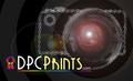
like the graphics in this. clean, simple. nice.
Post actions
I feel it needs a photo included in the sticker to represent a print.
Post actions
Is this the right dimensions?
Post actions
Looks like this would fit 2-up on the specified size -- could save on printing costs...
Post actions
Nice graphics, somehow the size doesn't seem right. 3 x 5?
Post actions
I like haveing both contest and prints on the same sticker.
Post actions
I like the simplicity - I'm not totally sold on the font you used for DPCPrints - the "C" seems a little distracting because it looks like a parenthesis - otherwise I think it's perfect
Post actions
Nice graphical layout - nice and simple with a smooth feel. Not keen on the font choice for the main text or the particular colours chosen. I'd like the green to be a paler blue.
Post actions
I like the simple layout and the coolo colors. Not sure about the drop shadow text. And I wonder will new people be motivated to come?
Post actions
Nice flowing design but unfortunatly the wrong size for the challenge.
Post actions
Excellent design work, but does it tell someone who's never seen it what DPC Pritns is?
Post actions
Spelt the site name wrong in the small text - it's dpchallenge, not dpcchallenge. Has the merit of simplicity.
Post actions
We'll I doubt this one is 3 x 5. Shame because it's really nice. Not sure how I should vote on it now. :(






 Add photograph to your favorites
 Add photographer to your favorites


