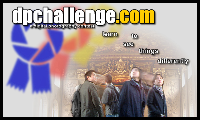
I like the effect on the people. I like the tag-line. The faded ribbons and the logo stands out clearly. The people might be a little small for a 3 inch tall sticker (they'd only be about an inch tall), but I like the design a lot. 9
Maybe should have made the blue ribbon more in focus and the red and yellow less blurry also. I don't really like the positioning of the "learn to see things diff" logo. The top URL is great.
Nice idea and like the way the photo element is blended into the white background. That said I think the photo is a little detailed and busy for use on what will be a small sticker - I think stickers work better when simple and not too detailed. Not keen on the blurring of the ribbon logo - don't think it goes with the photo treatment. Also don't like the red and yellow shadows of it. I particularly dislike the positioning of the text "learn to see things differently".
5, Kavey




 Add photograph to your favorites
 Add photographer to your favorites


 Photographer found comment helpful.


