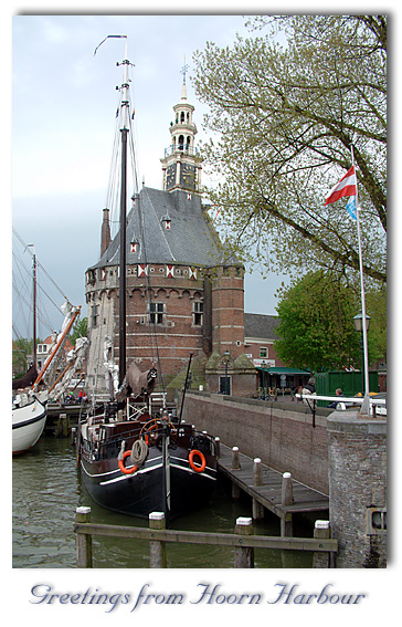
I don't think I have time to do anything better this week, I am not very happy with this photo. The big green container is in the way, the composition with the ships and all isn't perfect (could do better from the opposite of the water to the left, but that was a 10 minute walk while it just started to rain hard).
I would have preffered a landscape, early in the morning or late in the evening and with the ability to use grad color filters (I have them in PS, but is not allowed that way).
As said, I wanted to try out a lot more and different subjects as well, but than it started to rain, rain, rain, rain and some more rain. Perhaps I will find something in Belgium this weekend and be able to submit it Sunday evening.
Text = Nuptial Script with drop shadow, dark blue color and a pattern overlay.
One thing: I really hate all those @*$&@&$@)#-cars that are parked all over the place. It is freaking hard to photograph 17th century buildings without modern shit and cars in them. :(
Statistics
Place: 57 out of 106 Avg (all users): 5.7458 Avg (commenters): 7.5000 Avg (participants): 5.6486 Avg (non-participants): 5.9091 Views since voting: 1131 Votes: 118 Comments: 6 Favorites: 0
Very postcardy, and technically speaking a beautiful shot. The only thing that kept it at 9 and not 10 for me was a lack of a certain spung, that magic 'Wow!' spark. But I have to save 10s for *something*, right? :->
Good example of a postcard, maybe using a polarizer filter, or tweaking the curves or saturation in the post processing might have brought those colors out a lot more. Other than that, good idea.
I think this border would hav ebeen better without a drop shadow. It seems to give it a funny feel. Aside from that the image itself is pretty good though it seems somewhat small. It's hard ot make out some of the details taht owuld add a lot to this image. The color of hte text seems slightly out of place too. Overall nice shot.






 Add photograph to your favorites
 Add photographer to your favorites


 Photographer found comment helpful.


