I wanted to do a landscape photo with a circle theme, but there was just nothing appealing this week, so I had to settle for making my own composition.
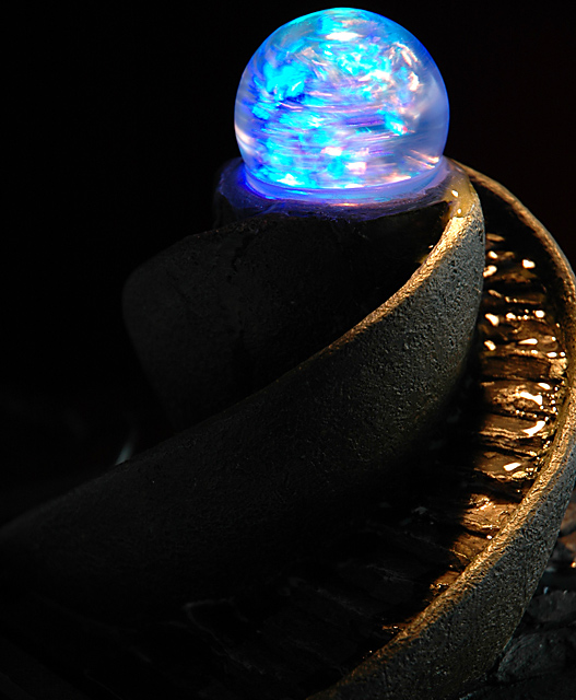
I used a water fountain that my song gave me for Father's Day, added a flashlight on top for the lighting, and started shooting. This was the best of the bunch.
For pp, I increased saturation via an adjustment layer, cropped and rotated, and applied USM.
Statistics
Place: 130 out of 545 Avg (all users): 5.3535 Avg (commenters): 8.1429 Avg (participants): 5.3140 Avg (non-participants): 5.4080 Views since voting: 1340 Views during voting: 428 Votes: 297 Comments: 11 Favorites: 2 (view)
Scott, I viewed the image, then with my initial thoughts read the comments and whilst maybe not a ribbon winner I think it should have scored higher. I think Heather hit the nail on the head, it is too tightly cropped from the top and right and the wisp of light bottom left is distracting. A very unusual shot, I like it.
Man, this should have won a ribbon! It has so many unique characteristics and the technical expertise to attain it is awesome. Well, you got a 10 from me anyway. :~(
If I didn't know that they crack down on photomanipulations such as layers etc here, I would have sworn that this was several photographs pasted masterfully together. The colours & contrasts are excellently put together. You and one other have recieved the highest score I have ever dealt out (although that doesn't say much with my only two / three weeks of competing ...) 8. I know, I'm strict, but you should see how I beat myself up about quality that I cannot fulfill ...
I think your crop is too close to the top and right. The left side of the photo contains nothing that adds to the photo at all. The right side is lit, but you cropped off the edge. Colors are neat, and great focus for being a low light shot. There is a small bright something in the background to the left that is distracting from the subject itself. overall I think this is a really neat image, technically well done, but needs a different crop to increase visual appeal. if the background was an issue, try placing a black cloth or something behind the subject to eliminate background elements. looks almost like you cropped to get rid of background crap. ~Heather~




 Add photograph to your favorites
 Add photographer to your favorites

 Photographer found comment helpful.


