For this contest everyone who has the word “circle” in their title is getting a max 10 score. This is a copy and paste version that I am including in every photo that I upgrade to 10 due to the title. We as members of DPchallenge need to be reminded of the topic of the challenge – we really need to reread the topic every time we reach a photo. If circle is in the title and it is appropriate I will give a 10. I am sorry if you do not agree with my method of voting – but scores are all I have.
For this contest everyone who has the word “circle” in their title is getting a lower score. This is a copy and paste version that I am including in every photo that I downgrade due to the title. We as members of DPchallenge know the topic of the challenge – we do not need to reread the topic every time we reach a photo. If circle is in the title and it is appropriate I will most likely not down grade, but it better be good. I am sorry if you do not agree with my method of protest – but scores are all I have.
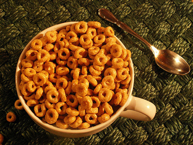
I like this picture, but I find the hue a bit to warm (orange and yellowish). I think a post processing hue/saturation and colors adjustment would help.
very warm lighting almost to warm for my tast i think it would've helped this to have set your white bal. according to your light very nice still life set up though.
What imediately comes to mind is the spoon is at an unnatural angle and the stray pieces on the lower left. I think the image might have been more interesting if milk was showing and maybe some color such as a strawberry or blueberries.
Your white balance seems to be far too warm (orange), at least on my monitor. The perspective is a little odd and it seems you'd have done better to go either completely topdown or more of a severe angle. As it is, the angle creates a very "normal" perspective as though I were sitting there looking at the cereal. The background material is distrcting and has far too much detail. The spoon could be omitted to greater effect. Decent effort, though.





 Add photograph to your favorites
 Add photographer to your favorites


 Photographer found comment helpful.


